If you have a sample or population of data and you want to understand the different properties, the different relationships among the variables in your data then you need to summarise and visualise it, that’s what descriptive statistics is really all about. Categorical variables deal with the characteristic or traits of the variable i.e., data at hand, generally represented in the column of the dataset.
This article focuses on categorical data, i.e., the different ways to study it both in terms of tables and graphical displays. We will start our journey with tabulating one categorical variable called frequency tables, these are just tables of counts. Later on, we have discussed about tabulating two categorical variables through contingency tables, this is when we have two categorical variables and we are just looking at a cross tabulation of counts or frequencies. We will also discuss way of graphing both one and two categorical variables. We also use mosaic plots for two categorical variable which are quite impressive and handy in graphing the two categorical variables.
This article covers the basic concepts of describing one and two categorical variables. In case of one categorical variable, it discusses summery statistics like proportion, frequency table and relative frequency table. The next portion in one categorical variable discusses bar chart and pie chart. To summarise two categorical variables, it discusses two-way table, difference in proportion and finally it visualizes two categorical variables through side-by-side bar chart, segmented bar chart and mosaic plot. The article is well suited for students, professional, educators and individuals who are just starting out in statistics and data science and wanted a solid grasp in the key fundamental.
Categorical Variable: Frequency Tables of counts
Categorical variables are variables that have values with different categories or qualities sometimes they’re called factors and the different categories are called levels. We have gone through some of these examples before like gender, respondent, approval or disapproval of a social policy, whether or not your regular smoker in our previous session. If you haven’t gone through the article, here is the link.

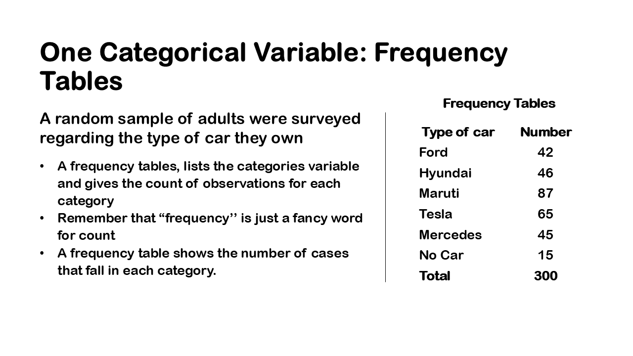
So, let’s take an example for better understanding, A random sample of adults were surveyed regarding the type of car they own among the four cars Hyundai, Maruti, Tesla, Mercedes, ford. Now we can raise some questions you might ask you know how many people have Mercedes, what proportion of passengers have ford. These kinds of questions where when you look at particular rows of a data set that can really prompt investigation of various ideas.
so, to answer these kinds of questions we will want to create tables and graphs for a single categorical variable, one way to really create a table of counts is through frequency tables a frequency table is just that it’s you take a categorical variable and you just calculate the counts of observations for each category. Frequency is just a fancy word for count so if you ever hear the word frequency you think counts, you’re just counting up how many in each category in terms of observations. So right now, I want us to focus on how many people have ford? So, we can look at the frequency table and say that 42 people have ford and 65 people have tesla and so on.
Relative frequency table of proportion and percentages

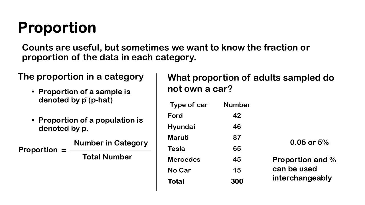
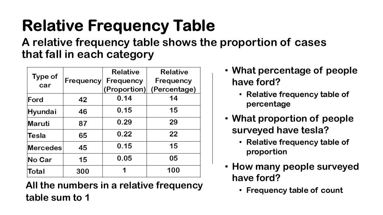
Besides the table of counts you can also create what’s called a relative frequency table sometimes a relative frequency is more useful than frequency table. So, a relative frequency is simply a proportion or percentage of each category, so to calculate the proportion you just divide the counts by the total number of cases and then that will give you the proportion. But usually, we want to multiply by 100 because often people like to express proportions as percentages. We call this a relative frequency table and it’s simply a table that gives the categories of a categorical variable and it gives the proportions or percentages of observations for each category.
So here is the example of the no. of people who have different cars in proportion. Please note that the all the numbers in a relative frequency table sum to 1. To express proportions as percentages so the way you do that is you simply multiply the proportions by 100.

so, let’s examine our research questions in the context of creating these relative frequency tables you might say what percentage of people have different types of cars. You could just create a relative frequency table of percentages in terms of the question. You may also ask what percentage of people have no cars? So, you can see that these research questions are quite easily answered through a collection of data and then this kind of basic analysis where you create a table of counts proportions or percentages.
Graphing one categorical variable

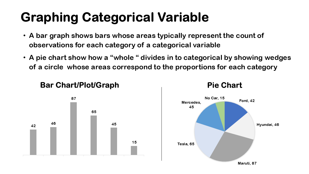
Now besides tables it’s often useful to visualize a categorical variable. To Really visualize a single categorical variable, it’s very common to either use a bar graph or a pie chart. Bar graph is usually preferred by statisticians; a bar graph shows the bars whose areas are representing the count of observations for each category of a categorical variable.
A pie chart basically shows how a whole is divided into categories and it shows wedges of a circle and each wedge has an area corresponding to the proportions for each category. These are the most common charts used throughout the academia and industry.
The above picture shows a bar graph, this is a bar graph of counts. So, it’s a frequency bar graph and I’ve presented the frequency table for comparison and you can see that the bar graph just duplicates the findings from the frequency table but sometimes it’s useful just to visualize the difference especially to really understand the differences between the number of observations in each category.
A pie chart shown above is based on a frequency table of counts but the wedges give you an idea of the relative proportion or percentage. A pie chart is replicating the bar graph of frequency counts you do see in the above figure that highest number of people have Maruti.
In a bar graph you can really easily compare the heights of the bars; with the pie chart it can be pretty difficult to really compare the relative sizes especially when the categories are pretty similar. The number of counts or the relative size of the counts meaning the proportions or percentages. I just want to emphasize that if you’re showing a table of counts or frequencies to a statistician or an expert it is better to present a bar graph.
you can see that in the bar graph it’s quite clear that highest number of people have Maruti and then the next highest category is Tesla. On the pie chart the difference between the Hyundai, ford and Mercedes is quite difficult to distinguish given the counts are removed. On the bar graph even, the counts are similar can still distinguish between the three categories meaning it’s you can still tell that there are more people in Hyundai, the pie chart. It really kind of washes that over this is why bar graphs are typically favoured by statisticians and experts in data visualization.


