Demo Example
Demo Example
Demo Example
Author

Campusπ

Browsing

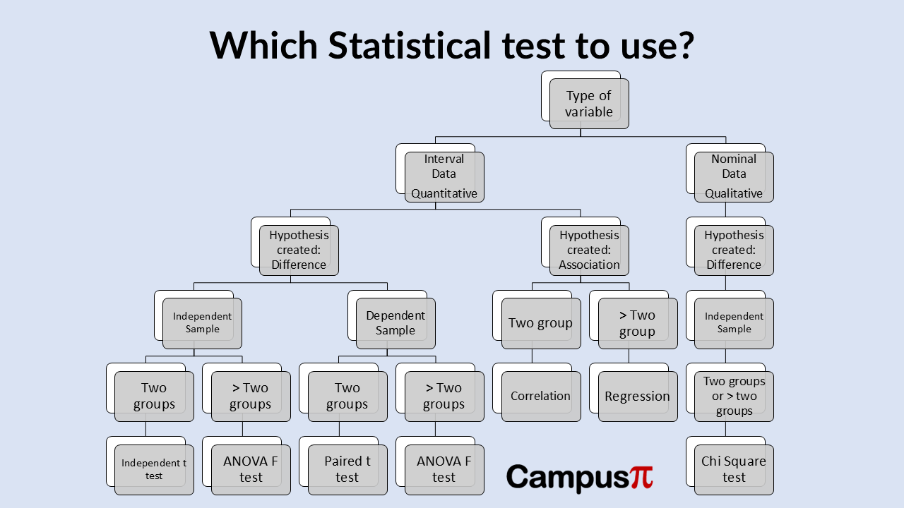
In the world of statistics and data analysis, understanding the relationship between two variables is crucial. One of the most fundamental tools used for this purpose is correlation. Correlation measures the strength and direction of a linear relationship between two variables. Whether analyzing stock prices, medical research data, or student performance, correlation plays a critical role in interpreting how variables interact.

Key Summary

  • Correlation is a statistical measure that expresses the extent to which two variables change together.
  • If an increase in one variable tends to be associated with an increase in another, the correlation is positive.
  • Conversely, if an increase in one variable tends to be associated with a decrease in another, the correlation is negative.
  • When the value of one variable increase while the other variable neither increases nor decreases, indicates that there is no apparent linear relationship.

Example

Let’s consider diabetes in the India. Imagine you’re an epidemiologist focused on nutrition, looking into the diabetes epidemic specifically. You’re interested in understanding which factors are linked to the percentage of people who are diabetes. You can start creating scatter plots after the data collection to explore potential relationships between different numerical variables and diabetes rates across India.

We can collect data of different states in India having diabetes. When collecting data, we can collect different aspects on individual like lifestyle (eating fruits and vegetables), smokers, air pollution or diet to gauze the association between diabetes.

Positive Association between variables – Percentage of Diabetes Vs Smokers 

We can use these variables in scatter plots to explore relationships, like this scatter plot showing the percentage of people who are diabetes compared to the percentage who smoke. In this example, we can see that the x-axis represents the percentage of smokers, while the y-axis shows the percentage of people classified as diabetes.

You can observe quite a bit of variation in the data, but one noticeable pattern stands out. States with a lower percentage of smokers generally also have a lower percentage of diabetes individuals, though this isn’t always the case. Similarly, states with a higher percentage of smokers tend to show higher diabetic rates as well.

Correlation

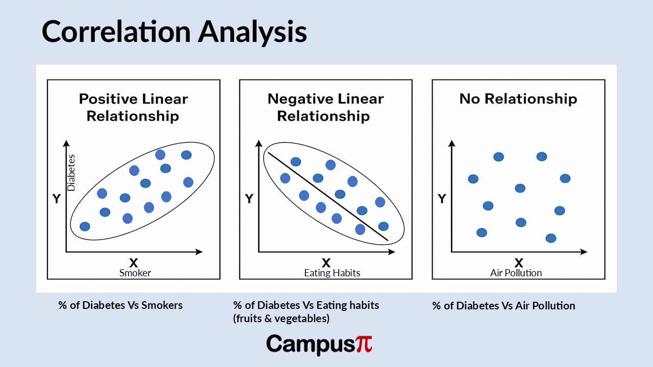
When values increase or decrease together, it indicates a positive linear relationship. For example, in each state, as the percentage of smokers rises, the percentage of individuals who are diabetes tends to rise as well. This creates an upward-sloping pattern in the data, reinforcing the idea of a positive linear relationship between these two variables.

You can envision this pattern as being roughly approximated by a straight line, which is what we refer to as linear. The term “linear” relates to the concept of a line and indicates that there is a straight-line relationship present, even if we aren’t fitting an actual line to the data. The data shows a pattern that implies a straight-line relationship, and it’s considered positive because both variables increase together and decrease together. Thus, we describe this relationship as a positive linear relationship.

Negative Association between variables – Percentage of Diabetes Vs Eating habits (eating fruits and vegetables)

Now, let’s examine a different set of variables from our dataset, specifically the percentage of diabetes individuals and the percentage of people who report eating fruits and vegetables. On the x-axis, we have the percentage of people eating fruits and vegetables, while the y-axis represents the percentage of diabetes individuals in each state. The pattern here differs slightly, showing a downward slope. When we look at the scatter plot, we can observe that states with a low percentage of people consuming fruits and vegetables tend to have a higher percentage of diabetes individuals.

The quadrant indicates that states with a high percentage of individuals consuming fruits and vegetables tend to have a lower percentage of diabetes individuals. Therefore, we can conclude that as the percentage of people eating fruits and vegetables increases, the percentage of obesity decreases.

In general, when the value of one variable increase while the other decreases, we can identify this as a negative linear relationship. Similarly, when one variable’s values decrease while the other increases, we can also describe this as a negative relationship. The pattern is consistent in both scenarios, and we can observe a downward-sloping trend in the data. You can envision fitting a straight line through this set of data to illustrate this relationship.

No Association between variables – Percentage of Diabetes Vs Air Pollution

Now, let’s examine a different scatter plot that displays the percentage of diabetes individuals and the air pollution in each state. Focusing on states with a low percentage of air pollution, we can observe that within this group, it’s difficult to draw any conclusions about the diabetic percentage. There seems to be a roughly equal distribution of states with low, medium, and high percentages of obesity.

When we examine states with a high percentage of air pollution, we find a roughly equal distribution of diabetic rates. Here, we can observe that there is a similar mix of states with high, medium, and low percentages of obesity.

This type of pattern in the data, where the value of one variable increase while the other variable neither increases nor decreases, indicates that there is no apparent linear relationship. Essentially, there is no discernible pattern in the data, resembling a cloud of points. Therefore, based solely on the scatter plots, we cannot identify a clear relationship between the variables.

Conclusion

We can begin to draw conclusions about obesity and the relationships between one numerical variable and a set of other numerical variables. Based solely on scatter plots, we can identify a general positive linear relationship between the percentage of diabetes individuals and the percentage of people who smoke cigarettes. This means that as the percentage of smokers increases, the percentage of diabetes also rises. Conversely, we can observe a negative linear relationship between the percentage of diabetes individuals and the percentage of those consuming fruits and vegetables.

Finally, we can conclude that there is no linear relationship between the percentage of air pollution and the percentage of diabetes individuals. As the percentage of air pollution increases, there is no significant overall change in the diabetes percentage. This observation leads us to consider that while scatter plots are useful for visualizing the relationship between two numerical variables and can suggest potential patterns, we may want to calculate a summary measure of association instead of relying solely on graphical interpretation. Also, it is important to note that correlation does not imply causation. Just because two variables are correlated does not mean one causes the other to change.


Choosing which statistical test to use, given the variables is often confusing for researchers and analyst. One of the major factors that decides the choice of statistical test is dependent on the types of the variable we have at hand. We have discussed two types of variable numerical (quantitative) and categorical (qualitative) variable.

Key Summary

Type of Test Variables Example
t-test (independent) Numerical vs. Categorical (2 groups) Exam scores of males vs. females
Paired t-test Numerical vs. Categorical (paired) Before-and-after blood pressure
ANOVA Numerical vs. Categorical (3+ groups) Different diets and weight loss
Pearson Correlation Numerical vs. Numerical Study hours vs. exam scores
Spearman Correlation Ordinal/Numerical vs. Numerical Satisfaction score vs. product price
Simple Linear Regression Numerical vs. Numerical Predict house price from square footage
Multiple Regression Numerical vs. Multiple Predictors Salary prediction based on experience, education
Chi-Square Test Categorical vs. Categorical Gender vs. Voting preference


  1. Correlation – Numerical vs. Numerical

Pearson Correlation

Let’s say we have numerical data and we want to show the association between the two variables, then we use the correlation analysis. Correlation analysis helps in testing relationships between variables and is often used when determining whether variables are correlated or not.

We use person correlation when we want to measures the strength and direction of a linear relationship between two numerical variables. For example, if we want to measure, is there a relationship between hours studied and exam scores? Using correlation analysis, we can show that the numbers of hours studies is perfectly correlated with exam score using sample data collected on different individuals. We can draw a scatter plot where on X axis we have number of hours studied and on Y axis we have exam scores.

We also assume that the variable is normally distributed, and a linear relationship exist. Correlation always lies between -1 to 1, where -1 in our analysis will represent the exact non-linear relationship and 1 represents that both the variables are perfectly correlated.

Regression Analysis (Predicting Outcomes) – Numerical vs. Numerical

If we have more than two numerical variable and we want to predict the outcome of one variable from the other we use regression. For example, predicting house prices based on square footage. This is an example of Simple Linear Regression. Again, we use the same methodology used in correlation except we draw a line which help predicts the house prices based on square footage. The regression line drawn is key which will show the house prices based on different data of square footage.

Multiple linear regression is just a simple extension of simple linear regression, and in practice we always use multiple regression. While simple linear regression is used when we have two variables, multiple regression is used when we predict a numerical dependent variable using multiple numerical and/or categorical predictors. In case of multiple linear regression example could be predicting salary based on experience, education level, and location.

So, to sum up between correlation and regression, let’s take an example if we want to predict the height of employees in a company and their salary, we can do scatter plot to measure the association between the two variables using correlation. When we hypothesized that taller employees are paid more than the shorter employees, it makes sense to predict the salary using height we will use the linear regression.

Which Statistical test to use?

  1. T test, F test or paired t test

Comparing Means (Numerical vs. Categorical Variable)

When we hypothesize there is a difference in average between groups, we can use t or F test. In this case, we can have two scenarios sample selection independent and sample selection dependent.

Paired t-test (Dependent t-test) – Numerical vs. Categorical (paired)

When we have dependent sample, which simply means that when we have two samples drawn on same individual in that case, we use paired t test or ANOVA (F test). Paired t test is used to compare means of two related groups (e.g., before and after). For example, does blood pressure decrease after taking a new medication? Here we have two samples on the same individual hence the samples are dependent.

Independent t-test (Two-Sample t-test) – Numerical vs. Categorical (2 groups)

When we have samples from different group of individuals, we use independent test or ANOVA (F test). Independent t test compares the difference in means between two groups that are independent of each other. Here, we are not measuring the same person before and after the treatment as in case of paired t test. We have independent observations and we are looking at the averages or mean. For example, if we want to measure, does the average test score differ between male and female students? We use independent t test. Here we have two different independent samples on male and female.

  1. ANOVA (Analysis of Variance) – Numerical vs. Categorical (3+ groups)

When we want to compare the means of three or more than three independent groups, we use ANOVA or F test. For example, if we consider, do different diets lead to different weight loss outcomes? Here we can see that the diets could be more than three and we measure the weight loss due to different diets used.

  1. Chi Square test -Comparing Proportions/Frequencies – Categorical vs. Categorical

When our primary interest is categorical, we use chi square test. It is used when testing relationships between categorical variables. It helps us determines whether two categorical variables are associated? For example, if we consider is there a relationship between gender and voting preference? We use Chi square test, as both the variables here is categorical. We can also use test of proportion when we have categorical data.

1. “Fallen angels will all go back up, eventually.”

A “fallen angel” is a stock that once performed well but has significantly declined. Believing it must recover is dangerous.

Some companies never regain their past glory due to poor fundamentals, bad management, or irreversible industry changes.

Blindly holding on can lead to bigger losses. The speculation of the recovery is not guaranteed.

2. “Stocks that go up must come down.”

While prices fluctuate, assuming that every rising stock must crash ignores the long-term growth potential of good companies.

Many strong businesses increase in value over time due to innovation, expanding markets, and solid earnings. Though corrections are natural, not every rise is followed by a crash.

The saying “stocks that go up must come down” reflects a belief that any rising stock is bound to fall eventually. While it’s true that no stock climbs forever without pauses or corrections, this phrase oversimplifies market behavior.

Stocks rise for valid reasons—strong earnings, innovation, or market dominance. While short-term pullbacks are common due to profit-taking or market cycles, fundamentally strong stocks can trend upward over long periods.

Assuming every gain will be followed by a major drop can lead to missed opportunities. It’s better to assess each stock on its merits rather than rely on blanket assumptions about price movements.

3. “Having just a little knowledge, because it is better than none, is enough to invest in the stock market.”

Believing that a little knowledge is enough to invest in the stock market can be risky.

While it’s true that basic understanding is better than none, limited knowledge may lead to poor decisions, emotional trading, or falling for hype and speculation.

The stock market is complex, influenced by multiple factors like earnings, interest rates, and global events. Without a solid foundation, investors might misunderstand risks or chase short-term trends.

Successful investing requires continuous learning, research, and discipline. It’s wise to start small and keep growing your knowledge. Informed decisions—not just minimal understanding—are what lead to long-term success in the market.

4. “The Stock Market Always Reflects the Economy”

The belief that the stock market always reflects the economy is a common misconception.

While the market often reacts to economic trends, it primarily reflects investor expectations about future performance, not current conditions.

Stock prices are influenced by sentiment, corporate earnings forecasts, and monetary policies, rather than real-time data like unemployment or GDP.

This disconnect is evident during crises, when markets may rise despite economic downturns, anticipating recovery.

Conversely, strong economic indicators may not always boost markets if expectations were already high.

Understanding this gap helps investors make more informed decisions rather than relying solely on market movement as an economic signal.

5. “Stocks Always Go Up in the Long Run”

The idea that stocks always go up in the long run is widely believed, but it’s only partially true.

While broad market indices like the S&P 500 have historically trended upward over decades, individual stocks don’t always follow this path.

Companies can underperform, stagnate, or even go bankrupt. Long-term growth also depends on factors like diversification, time horizon, and market conditions. Simply holding a single stock for years doesn’t guarantee profit.

It’s important to invest wisely, regularly reassess your portfolio, and avoid assuming that time alone will protect you from losses. Long-term success requires strategy, not just patience.

The basic principle of how stock prices move is based on market demand and supply. When there are more buyers than sellers for a stock, demand increases, pushing the price up. Conversely, when there are more sellers than buyers, supply outweighs demand, causing the price to fall. This simple yet powerful concept underlies all price movements in the stock market.

Key Summary

  • Stock prices fluctuate due to a variety of factors, all rooted in supply and demand. One of the main drivers is company performance—strong earnings reports, new product launches, or expansion plans often boost investor confidence and drive prices up.
  • Poor results or negative news can push prices down. Broader economic indicators also play a role; inflation, interest rates, and unemployment data can affect investor sentiment and market trends.
  • Market speculation and investor psychology are powerful forces—fear and greed can cause overreactions in either direction. Global factors like geopolitical tensions, pandemics, or commodity price shifts (like oil) can ripple through markets, impacting stock prices.

The Role of Supply and Demand in Stock Prices

At the heart of the stock market lies the simple yet powerful law of supply and demand. This principle determines the price of almost everything in a free-market economy — including stocks.

  • When demand exceeds supply — meaning there are more buyers than sellers — the price goes up.
  • When supply exceeds demand — meaning there are more sellers than buyers — the price goes down.

This concept is beautifully illustrated in the classic supply and demand graph. The intersection of the supply and demand curves marks the equilibrium price — the point at which the number of shares buyers want to purchase equals the number of shares sellers want to sell.

Why Do Stock Prices Fluctuate?

Stock prices change in response to a variety of factors, including:

  1. Company Performance
    • Strong earnings reports, new product launches, and successful business strategies attract more buyers.
    • Poor financial results or negative news lead to increased selling pressure.
  2. Economic Events
    • Interest rate changes, inflation data, GDP growth, and employment figures all affect investor sentiment.
    • Positive economic indicators usually push stock prices up, while negative data can cause prices to fall.
  3. Global Crises and Natural Disasters
    • Events like wars, natural disasters, and global pandemics (e.g., COVID-19) drastically shift investor behavior.
    • These events often result in significant reallocation of capital between different sectors.
  4. Industry Trends
    • If an entire industry is booming (e.g., tech during the early 2020s), companies within that sector often see their stock prices increase, even if individual performance varies.
  5. Market Sentiment and Speculation
    • Sometimes, perception alone drives prices. If investors believe a stock is going to do well, their collective buying can push the price up — regardless of the company’s actual performance.

Case Study: COVID-19 and Stock Market Shifts

One of the most impactful real-world examples of stock price change due to external factors was during the COVID-19 pandemic.

  • Utilities Sector:
    Many utility companies saw a drop in demand as businesses shut down and people used less commercial energy. As a result, the stock prices of utility companies declined.
  • Technology Sector (IT):
    In contrast, tech companies thrived during lockdowns. Remote work tools, video conferencing apps, and cloud-based services became essential. Consequently, IT companies saw a surge in demand, and their stock prices rose significantly.

This divergence highlights how different sectors respond to macroeconomic events and how investor demand shifts based on perceived future value.

Using Supply and Demand to Make Smart Investment Choices

By understanding the dynamics of supply and demand, investors can make more informed decisions. While it’s impossible to predict the stock market with certainty, observing the balance between buyers and sellers, as well as tracking sentiment and news, can provide valuable insight.

Here are some practical tips:

  • Watch trading volumes: A price movement accompanied by high volume suggests strong conviction.
  • Stay informed: Follow economic data releases, earnings reports, and global news.
  • Diversify: Spread investments across sectors to manage risk during unpredictable events.
  • Use technical analysis: Price charts often reveal patterns related to supply and demand behavior.

When analyzing distributions, we often discuss their modalities. The modalities is the number of peaks they exhibit. A distribution with a single prominent peak is termed unimodal. If there are two distinct peaks, it’s called bimodal, and with three peaks, it’s referred to as multimodal. These modalities describe the visual appearance of peaks in a distribution, highlighting where data points cluster most prominently.

However, identifying the number of modes in a distribution isn’t the same as determining its numerical mode, which represents the most frequently occurring value. A dataset may visually show multiple peaks (bimodal or multimodal), yet numerically, it might have only one mode.

For instance, imagine a dataset graphed as having two peaks. While numerically there might be one mode—the value with the highest frequency—visually, it’s evident that the data can be separated into two distinct distributions overlaid on each other. This visual distinction underscores the presence of two modes when considering the underlying distributions independently.

Understanding modalities in distributions is crucial for interpreting data patterns accurately. It helps analysts recognize when data may represent multiple underlying trends or phenomena, despite numerical summaries suggesting otherwise. This distinction ensures that insights drawn from data reflect its true complexity and structure, enhancing the reliability of statistical analyses and conclusions.

We can take an example of Air Quality Index. The AQI distribution will be right-skewed because of a few cities with extremely high pollution levels. These outliers skew the mean AQI upwards, making it appear higher than the median or 50th percentile. This skewing effect demonstrates why the mean can be misleading as a summary measure of typical air quality.

Despite the skew, the AQI distribution will be unimodal. This means that most cities’ AQI values cluster around a single peak, which lies in the lower to mid-range of the AQI spectrum. Most cities enjoy moderate air quality, but those few outliers with extremely high AQI values pull the overall mean upwards. This visualization highlights the importance of considering both the central tendency and the spread of data to get a true picture of air quality across different cities.

Let’s consider another example, where we did a survey of schools of get the age of every individual. When we plot the density curve, we will get a bimodal distribution. The reason we get a bimodal distribution is that the ages of the students and teachers get mixed which will create two modes of distribution. So, modality of distribution often provides a good insight in deciphering the statistical analysis.

Sharpe Ratio is the most extensively used metric in the finance world to evaluate the performance of an investment. It measures the return of an investment relative to its risk, offering a clearer perspective on the efficiency of a portfolio. Sharpe Ratio is defined as the ratio of the expected return and volatility. By incorporating both return and volatility, the Sharpe Ratio helps investors make more informed decisions about their investments. By adjusting portfolios to maximize the Sharpe Ratio, investors can achieve a better balance between risk and return.

Key Summary

  • Sharpe Ratio is the ratio of the expected return and volatility. By incorporating both return and volatility, the Sharpe Ratio helps investors make more informed decisions about their investments.
  • A higher Sharpe Ratio suggests a better risk-adjusted return, while a lower value indicates that the investment may not be adequately compensating for the level of risk taken.
  • When judging on a particular strategy, if the back testing results shows that the Sharpe Ratio is 2, it simply builds confidence that it’s a good strategy.
  • In case of two negatively correlated stocks, we need to diversify the stock through creating a portfolio of two stocks, this will increase the Sharpe Ratio that both the stocks combined have.
  • Sharpe Ratio treats all volatility as undesirable, failing to distinguish between upside and downside risk.

Majority of investors consider returns as one of the major parameters to judge the portfolio but investing is not only about return. The Sharpe Ratio essentially indicates how much excess return an investor earns per unit of risk. A higher Sharpe Ratio suggests a better risk-adjusted return, while a lower value indicates that the investment may not be adequately compensating for the level of risk taken.

Stocks with same return

Let’s consider an example of two investment stock A and stock B, having the same return, the seldom question arises, which one is better? In order to answer which of the investment is better, we just can’t see returns as both the stock have the same return.

Sharp Ratio

We can look in the given figure, the path of both the stocks taken to reach the same return. We can see that stock A took linear path; however, the stock B had a more volatile path.

In seems intuitive that stock A seems better, also stock B is painful to hold when it goes in downtrend and cheerful when in uptrend. On the other side, the stock A is following a steady path. There is high uncertainty in the stock B to recover the investment, when its goes down to negative.

One of the other reason stock B is bad is also due to liquidity. It may happen that at some point of time we need our money; what happens when we need it and the stock is down to 10%. We may have to sell at loss while on the other hand stock A is growing steadily at every point, the slope is consistent. We can interpret with the above logic that stock A is better investment than stock B, while both of them have the same returns.

To quantify our intuitive understanding, we use Sharpe Ratio to judge which stock perform better. The Sharpe Ratio is the risk adjusted measure performance. It is the ratio of the average daily return divided by the volatility. Volatility in the denominator punishes the returns. More the volatility is the lower the return will be.

Sharpe Ratio

The Sharpe Ratio of the both the stocks discussed as example is different which gives a healthy metric to judge an investment better. Stock A has a Sharpe Ratio 2 while the stock B have a Sharpe Ratio of 0.5 which validate our intuition that stock A is better. A higher Sharpe Ratio generally signifies that it had managed its risk and returns properly.

Interpreting the Sharpe Ratio

A Sharpe Ratio above 1 is generally considered good, as it implies that the investment provides sufficient returns for the risk involved. A ratio above 2 is viewed as very good, while a value exceeding 3 is deemed excellent. Conversely, a ratio below 1 suggests that the risk taken may not be justified by the returns, making the investment less attractive.

Negative correlation and diversification  

Let’s consider another example with two stocks A and B having the same Sharpe Ratio. Which simply mean both have the same return and volatility. How do we identify the two stocks which one is better? As we can see in the graph, both the stocks are negatively corelated and a combination of both the stock A and B will give an optimum return. Both the stocks have a Sharpe Ratio of 2 while the combination of both have the Sharpe Ratio of 5. This is why we need to diversify the negatively correlated stocks.

Sharp Ratio

Limitations and Alternatives

Sharpe Ratio assumes that returns are normally distributed, which may not always be the case in real-world financial markets. Additionally, it does not account for the potential impact of extreme market events, known as tail risks.

Sharpe Ratio treats all volatility as undesirable, failing to distinguish between upside and downside risk. Some investors prefer alternatives such as the Sortino Ratio, which focuses only on downside deviation, or the Treynor Ratio, which considers systematic risk instead of total risk.