
Creating good graphics is a very important part of data visualization. Data visualization is not a science this is an art. It is imperative to know the concepts – biased labelling, misleading scales, excessive visualization and low data to ink ratio. The data visualizations principles should resonate with the statistical analysis that give a visual appeal, remove biasedness and complexity out of data.
Key Summary
- Biased labelling- Loaded words or phrases should be avoided that might obscure the information and are pejorative.
- Misleading scales, no scale or labels -We should avoid is misleading scales and truncated scales or no scales at all.
- Excessive visualizations – We should avoid excessive decoration or visual clutter.
- Low “data- to Ink” ratio- The general idea for high data to ink ratio is that any graph we create for statistical purpose should convey much information about the data. A low data to Ink ratio is a graph that doesn’t say much about the data, it spills a lot of ink or redundant information
- Unequal areas – The area occupied by any part of a graph should correspond to the magnitude of the value it represents.
Biased labelling
Biased labelling is one of the things to avoid when creating a graph for statistical purposes. Loaded words or phrases should be avoided that might obscure the information. As we can see in the figure a bar graph is labelled as poor people instead of lower-class category. It’s really pejorative and we should avoid that and be as neutral as possible in the labels.
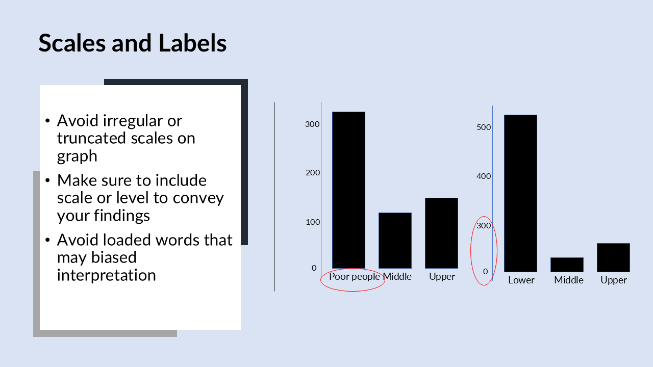
Biased labelling -Misleading scale and no scales
Another thing we should avoid is misleading scales and truncated scales. In the example above the scales are shortened to artificially inflate the effect size.
We have truncated the scale for frequency the number of counts which is visible as scale jumps from zero to 300. This sort of truncation of the scale really makes it look like the lower-class number of counts is vastly more than the middle and upper class. It’s artificially inflating the number of counts visually in the lower class.
Another problem that can go on is having no scale or labels. Make sure to include all appropriate scales or labels with the point to convey our findings effectively.
Excessive Visualizations and Low Data to ink ratio
We should avoid excessive decoration or visual clutter. This is also known as low data to Ink ratio. We should keep high data to ink ratio. The general idea is that any graph we create for statistical purpose should convey much information about the data.
A low data to Ink ratio is a graph that doesn’t say much about the data, it spills a lot of ink or redundant information. In the example we have colorings that really not informative. Its unrelated to the data and excessive visualization can really overwhelm the reader.
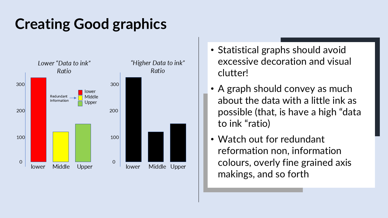
As we can see in the above figure lower, middle, and upper classes and the axis is labelled with different colorings. The problem is that this is totally redundant, it’s excessive decoration we don’t need it and it can actually just be misleading because the reader might think that it’s something different. The colors of the different bars also not needed because they already have different labels the reader already knows that these different categories are part of the same categorical variable.
When we remove the color we have the kind of bar graph on the left-hand side. The graph is really better having high data to ink ratio meaning, we are saying more about the data with less ink on the paper. So, it’s useful to compare these two graphs, the one graph has a low relatively data ink ratio,, the other one is a high data ink ratio.
Unequal areas
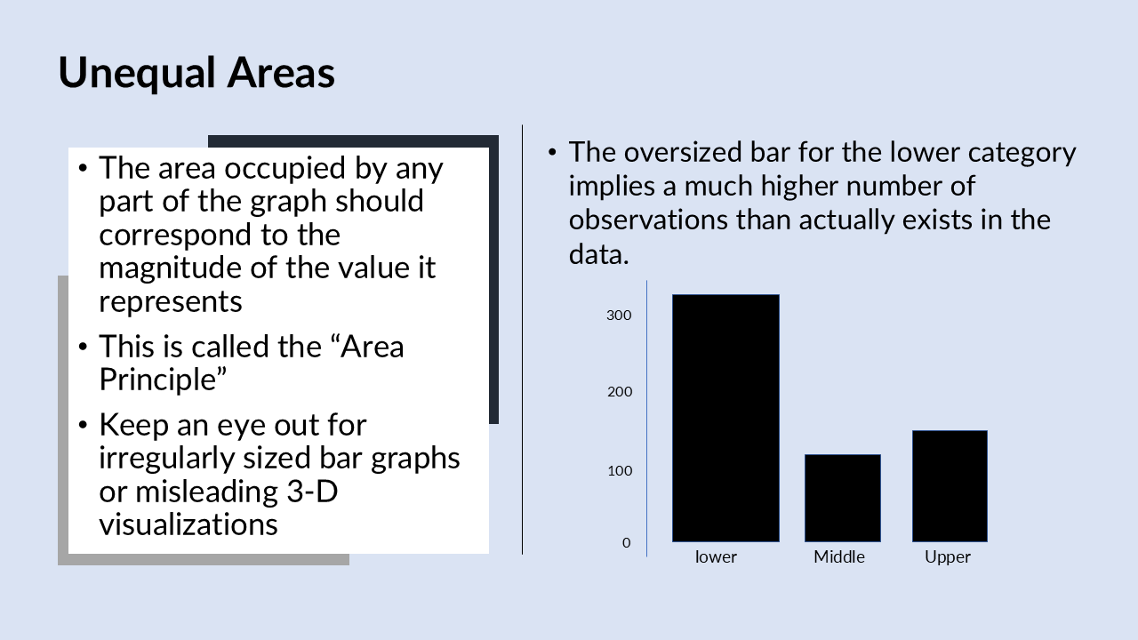
Another problem that can occur in creating a statistical graph is unequal areas called the area principle. The idea is that the area occupied by any part of a graph should correspond to the magnitude of the value it represents.
We should avoid is 3D visualizations because this can really violate this idea of the area principle. It can imply that certain wedges or certain bars are much larger than the other just by virtue of the way it is presented in a 3D context.
The above graph shows an example in a 2D context of violating the area principle. This is just the same bar graph of counts for the different categories of the passenger class variables. We have lower, middle, and upper classes and then we have a number of counts.
However, the lower class it’s much larger bar, width-wise which is meaningless, there’s nothing about the width that is informative. It implies many more observations that lower category than actually exists. This is really a violation of the area principle because the size of the bar is not in relation to the magnet attitude of the value it represents.


?")