Demo Example
Demo Example
Demo Example
Author

Campusπ

Browsing

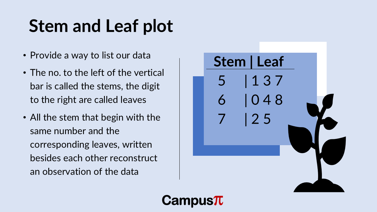
Histograms are incredibly useful when you have a large dataset and want to visualize the distribution of a numerical variable. Unlike stem-and-leaf plot or dot plot that can become cluttered with too many data points, histograms groups data into intervals, or bins. Each bar in a histogram represents an interval, and its height corresponds to the number of observations within that interval.

Histogram

What makes histograms versatile is its ability to adapt to datasets of any size. Whether you’re working with a small sample in psychology or a massive dataset in epidemiology; histograms can effectively summarize the data while maintaining clarity. By adjusting the number of bins, you can fine-tune the level of detail in your visualization, capturing broader trends or focusing on specific nuances in the data distribution.

Key Takeaway 

  • Histograms can effectively summarize the huge data while maintaining clarity. It is most widely used chart also for checking normality assumption in data set.
  • It is helpful in spotting outliers.
  • The representation of data heavily depends on the number of intervals, or bins, chosen.

Histograms are a go-to tool in data analysis because it provides a clear, visual snapshot of how data points are spread across different ranges, making them indispensable for exploring patterns and outliers in numerical data.

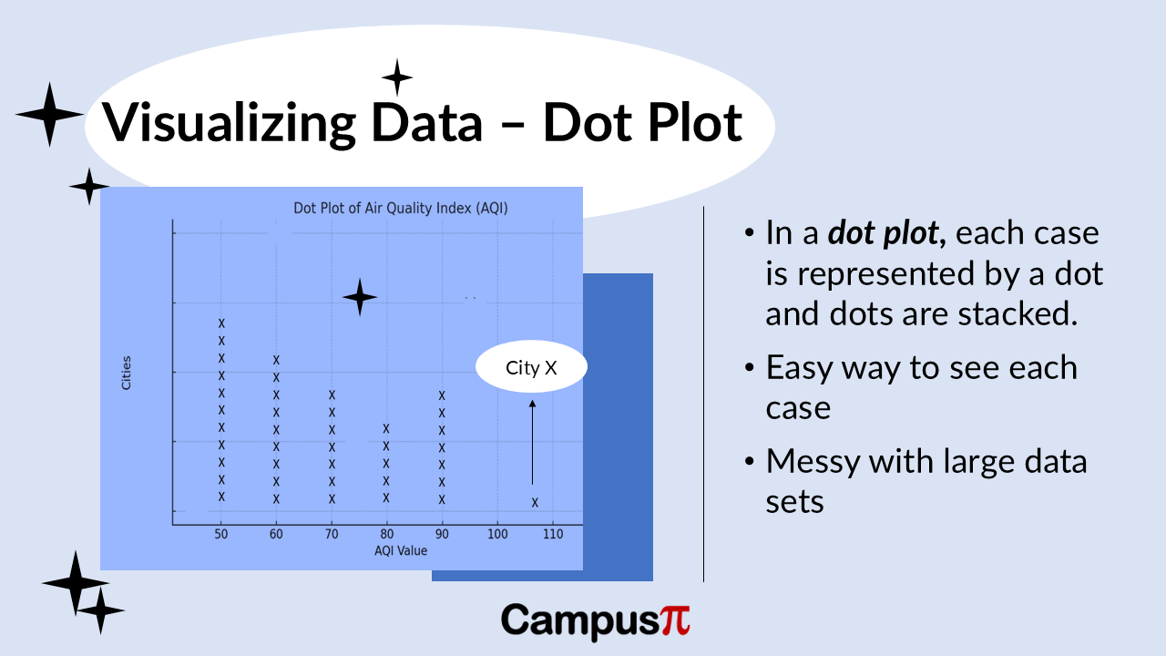
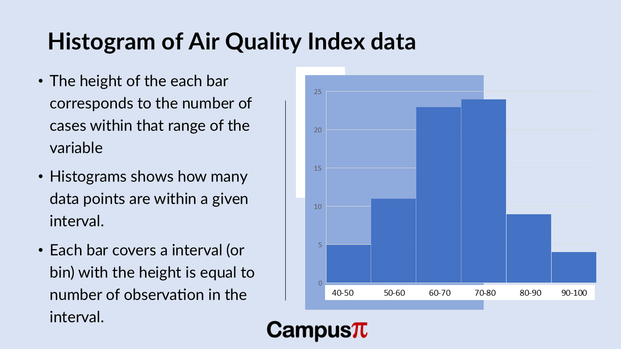
Here’s a histogram of the Air Quality Index (AQI) dataset. Similar to the Dot Plot and stem-and-leaf plot, the histogram reveals insights into the distribution of AQI values.

We can see that most cities have AQI values clustered in the moderate range, indicated by the taller bars in the 60-80 AQI range. However, there’s variability across the dataset, particularly noticeable in the lower and higher ends of the AQI spectrum.

The smallest bar on the left side of the histogram represents a few cities with exceptionally good air quality, possibly with AQI values below 50. Conversely, there might be a smaller bar on the right-side indicating cities with higher AQI values, potentially between 90 to100.

This visual representation effectively highlights any outliers or extreme values in AQI across different cities, offering a quick overview of how air quality is distributed within our dataset.

Histogram with bins

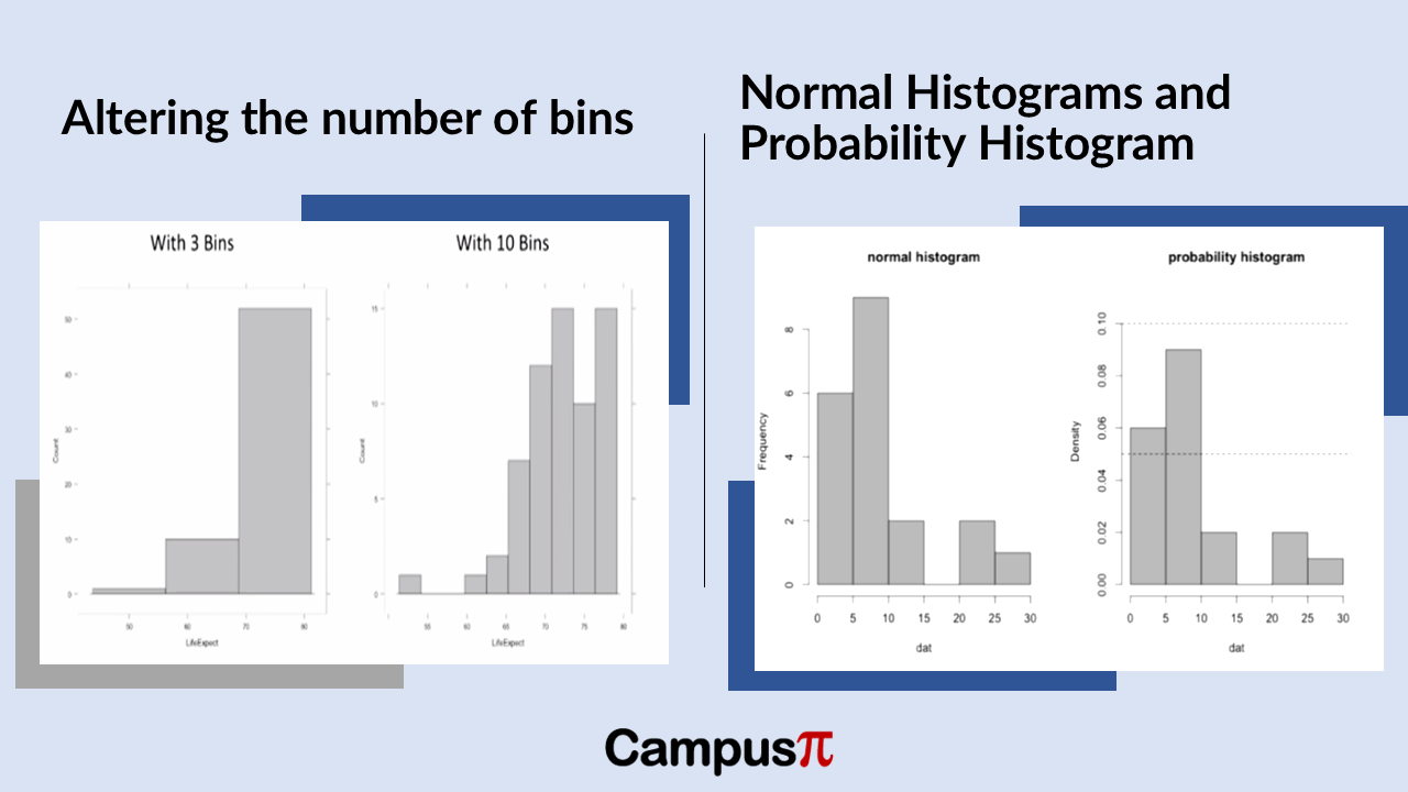
When creating a histogram of the Air Quality Index (AQI) in our dataset, the representation of data heavily depends on the number of intervals, or bins, chosen. For instance, comparing a histogram with three bins to one with ten bins can drastically alter how the data distribution appears.

With fewer bins, such as three, the histogram provides a broader overview, showing general trends and broad ranges of AQI values. In contrast, using ten bins offers a more detailed, granular view, revealing nuances in AQI distribution across narrower ranges of values.

However, histograms can be misleading if not carefully constructed. If the number of bins is too low, important details like multiple peaks or variability in AQI values might be obscured. Conversely, too many bins can create a noisy or cluttered histogram that complicates interpretation.

In summary, selecting the right number of bins in a histogram is crucial for effectively visualizing and understanding the distribution of AQI data. It strikes a balance between capturing meaningful patterns and avoiding the oversimplification or overcomplication of data insights.

Stem and leaf plot is used to plot for a numerical variable. It’s essentially a way to list our data in an organized manner. In a stem-and-leaf plot, we have “stems” and “leaves.” The numbers to the left of a vertical bar are called stems, while the digits to the right are called leaves.

All stems that start with the same digit have their corresponding leaves written beside them. This setup allows us to reconstruct each observation in the dataset by combining the stem and the leaf.

Key Takeaway

  • Stem and leaf plot is used to plot for a numerical variable.
  • The numbers to the left of a vertical bar are called stems, while the digits to the right are called leaves. All stems that start with the same digit have their corresponding leaves written beside them.
  • We get an instant snapshot of the minimum and maximum values.
  • This plot helps us understand the distribution of values, identify the range, and see the frequency of specific values at a glance.

Let’s create a stem-and-leaf plot for the Air Quality Index (AQI) of our cities. Each observation has its own number, with a vertical bar separating the stems from the leaves.

For example, in our stem-and-leaf plot:

  • The numbers to the left of the vertical bar are the stems.
  • The numbers to the right of the vertical bar are the leaves.

Typically, a stem-and-leaf plot will specify what differentiates a stem from a leaf. In this case, the stem represents the leading value of our AQI number, and the leaf represents the digit in the ones place.

Steam and Leaf Plot

Here’s a simple example for clarity:

In this example:

  • The stem “5” with leaves “1, 3, 7” represents AQI values of 51, 53, and 57.
  • The stem “6” with leaves “0, 4, 8” represents AQI values of 60, 64, and 68.
  • The stem “7” with leaves “2, 5” represents AQI values of 72 and 75.

This plot helps us see the distribution of AQI values and allows us to easily reconstruct the actual data points from the stems and leaves.

In our dataset, we have integer values for the Air Quality Index (AQI) such as 54, 56, 78, and 80, without any decimal places. Using a stem-and-leaf plot, we can quickly visualize this data.

For instance:

  • The lowest AQI in our dataset is 54, represented by a stem of 5 and a leaf of 4.
  • The highest AQI in our dataset is 80, represented by a stem of 8 and a leaf of 0.

Here’s what our stem-and-leaf plot might look like. We can also see it in the above figure.

Stem | Leaf

5  | 4 6

6  | 0 2 5

7  | 1 3 8

8  | 0

In this plot:

  • The stem “5” with leaves “4, 6” represents AQI values of 54 and 56.
  • The stem “6” with leaves “0, 2, 5” represents AQI values of 60, 62, and 65.
  • The stem “7” with leaves “1, 3, 8” represents AQI values of 71, 73, and 78.
  • The stem “8” with leaf “0” represents an AQI value of 80.

From this stem-and-leaf plot, we get an instant snapshot of the minimum and maximum AQI values. We can also see how many cities fall into specific AQI ranges. For example, if the plot showed that five cities had a stem of 7 and a leaf of 5, it would indicate that five cities have an AQI of 75.

This plot helps us understand the distribution of AQI values, identify the range, and see the frequency of specific values at a glance.

Problem with Stem and Leaf plot

One thing to note about a stem-and-leaf plot, similar to a Dot Plot (link to article 24), is that it works best for small datasets since all observations are represented individually. For our dataset of countries, the number of observations is manageable, making the stem-and-leaf plot quite useful.

However, for larger datasets—like those with a million people, ten thousand observations, or even 500 people, which is common in survey research in social sciences and humanities—a stem-and-leaf plot can become messy and difficult to interpret. The visual clutter from so many data points can overwhelm the plot.

In such cases, it’s more practical to use other methods or to subset your sample to a smaller set of observations. For example, in psychology, datasets are often smaller, making a stem-and-leaf plot more feasible and helpful.

So, while stem-and-leaf plots are great for small datasets, their utility diminishes as the dataset grows larger. For larger datasets, consider other visualization techniques or focus on smaller subsets to keep the plot clear and informative.

We can get the numerical summary through measures of central tendency, location, and variability for numerical data. But numbers alone don’t always tell the full story. To truly understand data, especially when considering measures of spread, it’s crucial to visualize it. Seeing the data can reveal patterns and insights that raw numbers might obscure. By creating visual representations, we can get a clearer picture of the distribution and observe how spread out our observations really are. Let’s explore how visual tools can bring our data to life and enhance our analysis!

Key Take away

  • Each dot represents a different observation, indicating a different data point.
  • Dot Plot is quite useful for understanding the central part of the distribution, the spread, and spotting outliers.
  • Dot Plot become very messy and difficult to interpret with larger data because of the sheer number of data points.

Example

Imagine you’re an environmental scientist keen on understanding air quality across various cities. Why do some cities enjoy fresher air while others struggle with pollution? How widespread is the variation in Air Quality Index (AQI) across these cities? What’s the typical AQI if we consider all these cities together?

To tackle these questions, your first step would be to visualize the central tendency of AQI—essentially, where most AQI values cluster—and its distribution across different cities. This will give a snapshot of typical air quality. Following this, we would delve deeper into examining the spread of AQI values, exploring how far apart the best and worst air qualities are.

Visualizing these measures of central tendency and spread is crucial. It transforms raw data into a more intuitive format, making it easier to grasp the overall picture of air quality and identify any patterns or outliers that might need further investigation.

Let’s consider the example for our analysis. Here’s the following columns represents the following:

  1. City: The name of each city.
  2. Population Density (people per square km): This variable shows how crowded a city is. Some cities have a high population density, while others are more spread out.
  3. Air Quality Index (AQI): This variable indicates the quality of air in each city, with lower values representing better air quality.
  4. Average Income per Capita: This is a measure of the average income for individuals in each city. In environmental studies, income per capita can be a key factor in understanding variations in air quality and other environmental outcomes.

By analyzing these variables, we can uncover important insights about the factors influencing air quality in different cities.

Dot Plot

Dot Plot

Let’s visualize this data to see how these factors interact and impact air quality across various urban areas! Here’s a Dot Plot of the Air Quality Index (AQI) in our dataset. In a Dot Plot, we typically use one dot for each observation. In this case, we have a set of cities, and each dot represents a different city, indicating a different data point or observation.

On the y-axis (the vertical axis), we have the frequency, which is the number of observations or data points for each AQI value. We can see that many cities have similar AQI values, resulting in some clustering. However, there is also variation in AQI across different cities.

We can see that most cities cluster around AQI values in the 50s,60s and 70s, indicating moderate air quality. This clustering shows the typical air quality in our set of observations. However, we do have an outlier. This outlier is City X to the extreme right, which has a significantly higher AQI, indicating much poorer air quality than the other cities.

In fact, City X is the only city in our dataset with an AQI above 100. This Dot Plot is quite useful for understanding the central part of the distribution, the spread, and whether there are any outliers. In this case, City X stands out as an outlier with much worse air quality compared to most other cities in our dataset.

Drawback

One issue with a Dot Plot is that it can become messy with large datasets. Since we are plotting each observation, if we have a large number of data points, say a dataset of a million cities, a Dot Plot will be very messy and difficult to interpret because of the sheer number of data points.

Variance represents the average of the squared deviations from the mean. Because we square the deviations, the variance is always a non-negative value, meaning it’s either positive or zero. The method for calculating variance slightly varies depending on whether we are dealing with a sample or a population.

Lets consider an hypothetical example of income, when we analyze income data, we discover that the sample variance is a large figure. Since this is a sample from a population, the sample variance is measured in thousands of rupees squared. This unit, rupees squared, can be challenging to interpret directly. Hence, we prefer using the standard deviation because it will be expressed in rupees, which provides a more intuitive understanding of the variability in the income data.

Key Takeaway 

  • The standard deviation represents the typical distance of observations from the mean.
  • When the standard deviation is low, it suggests that most values cluster closely around the mean, indicating less variability.
  • Conversely, a larger standard deviation implies greater variability, with values more spread out from the mean.

Standard Deviation: Population and Sample

When we discuss standard deviation, whether from a population or a sample, the formulas are essentially the same. We simply take the square root of the variance. In the case of population standard deviation, it’s the square root of population variance, and for sample standard deviation, it’s the square root of sample variances.

For our income data, calculating the sample standard deviation is straightforward using statistical software. Taking the square root of our sample variance gives us a standard deviation of approximately 55,000 rupees. This measurement is in the original units of rupees, unlike the sample variance, which is in rupees squared.

Conceptually, the standard deviation provides an indication of the typical distance of our income observations from the sample mean. On average, we can interpret this standard deviation to mean that incomes vary by about 55,000 rupees.

Standard Deviation Interpretation w.r.t Mean

Standard deviation interpretation with respect to mean

To better understand the standard deviation, especially in relation to income or any dataset, it’s helpful to consider its interpretation alongside the mean. The standard deviation represents the typical distance of observations from the mean.

For instance, if we have a dataset with a mean income of INR 100 and a sample standard deviation of INR 0, what does this tell us about the spread of the data? Well, with a standard deviation of zero, it means all values in the dataset are exactly 100. Therefore, the spread of the data in this case would be considered none.

This example illustrates how the mean can aid in interpreting the standard deviation. When the standard deviation is low, it suggests that most values cluster closely around the mean, indicating less variability. Conversely, a larger standard deviation implies greater variability, with values more spread out from the mean. This comparison helps provide a more intuitive understanding of what the standard deviation measures in a dataset.

If we have a sample standard deviation of one rupee and a sample mean of 100, it indicates that the data points are relatively close to the mean. The standard deviation being much smaller than the mean suggests that most observations cluster tightly around the mean value of 100. Therefore, the amount of variability or spread in the data is minimal in this case. A sample mean of 100 and a standard deviation of 5 and is still pretty small there’s not going to be very much variation around the data set.

Suppose our sample mean is 100 and the sample standard deviation is 75. In this case you can say the sample standard deviation is pretty close to the sample mean. So, let’s say that there’s just a medium amount of variability, you can think of it as there are quite a few observations around this sample mean but there is some degree of spread. Finally consider a mean of 100 and a standard deviation of ten thousand then the overall spread of the data it’s going to be large.

We can interpret the sample standard deviation by comparing it with the sample mean. In each scenario we’ve discussed, we’ve kept the sample mean consistent while varying the sample standard deviation.

When the sample standard deviation is significantly large compared to the sample mean, it indicates that the data points are widely spread around the mean. Conversely, if the sample standard deviation is relatively small compared to the sample mean, it suggests there is little variation, meaning most observations are closely clustered around the sample mean. Thus, comparing the standard deviation to the mean helps us gauge the degree of variability in the dataset.

Standard Deviation of Income

Let’s examine our income data to understand what the standard deviation is telling us. The sample standard deviation is 55,000, while the mean income is around 37,000. Since, the sample mean is smaller than the standard deviation, this indicates a relatively large spread around the mean. In other words, these values suggest a significant degree of variability in incomes based on this sample data.

In previous article we discussed about variance and standard deviation, assuming we had a population of data, even though we referred to it as a sample. However, in practice, the formulas used to calculate variance and standard deviation will differ slightly depending on whether the dataset is a sample drawn from a larger population or if it represents the entire population itself.

Key Takeaway 

  • We compute population variance by summing the squared deviations of each observation from the population mean, adding them together, and then dividing by the sample size n.
  • However, in case of sample variance we divide by n-1, where n is the number of observations in the sample.
  • we divide by n−1 because of degrees of freedom, degree of freedom provides an unbiased estimate of the population variance when working with a sample.
  • Degrees of freedom refer to the number of independent pieces of information or values that can vary freely in a dataset or calculation.
  • In essence, n−1 accounts for the adjustment needed to ensure that our sample statistic, such as variance, provides an unbiased estimate of the population parameter, considering the limitations imposed by using sample data rather than the entire population dataset.

Variance of a Population

So, when discussing the variance for a population, we use the Greek letter sigma squared. This notation is a convention used for population parameters, where Greek letters are typically employed. To calculate the population variance, we subtract the population mean from each observation, square the result, sum all these squared deviations, and finally dividing by N.

Population Vs Sample Variance

Variance of a Sample 

When calculating the variance for a sample, we follow a slightly different approach and use Latin or Roman letters to distinguish it from population variance. This distinction is important in statistics to indicate whether we are working with a sample or the entire population dataset.

Conceptually, the calculation for sample variance, is similar to that for population variance. We compute it by summing the squared deviations of each observation from the sample mean, adding them together, and then dividing by the sample size n, where n is the number of observations in the sample. However, a key difference is that instead of dividing by n (the total sample size), we divide by n−1. This adjustment accounts for the fact that using n−1 degrees of freedom provides an unbiased estimate of the population variance when working with a sample.

Why we divide by n-1?

The reason we divide by n−1 instead of n when calculating sample statistics like variance relates to the concept of degrees of freedom. Degrees of freedom refer to the number of independent pieces of information or values that can vary freely in a dataset or calculation.

When we gather a sample from a population, we use sample statistics to estimate population parameters. For instance, when calculating sample variance, we rely on the sample mean as part of the calculation. The degrees of freedom in this context, n−1, represents the number of independent observations that can vary freely after using one sample statistic (the mean) to estimate variance.

In essence, n−1 accounts for the adjustment needed to ensure that our sample statistic, such as variance, provides an unbiased estimate of the population parameter, considering the limitations imposed by using sample data rather than the entire population dataset.

The sample mean, is computed by summing all the observations in our sample and dividing by the sample size n. No other sample statistics are used in this calculation. The degrees of freedom in the context of sample variance is n, which is the sample size minus zero adjustments. This reflects the number of independent observations available in our sample.

When we calculate the sample variance, we use the sample mean X bar as part of the calculation. Because we rely on one sample statistic (the mean) to estimate another (the variance), the degrees of freedom become n−1. This adjustment ensures that the sample variance provides an unbiased estimate of the population variance, considering the constraints of using a sample rather than the entire population dataset.

Degrees of freedom

Degrees of freedom has to do with constraints. So, it’s really constraints on the possible values of a set of observations. Suppose we have a small data set that just consists of three numbers and we abstractly, we call these x1, x2, x3.

If you’re told that we have no constraints, then each number could be anything than first number could be one, the second number could be five, the next number could be a million. So, we have no constraints, if we have no constraints these values are free to vary, there are three independent pieces of information.

Degree of freedom

Imagine we have a dataset where the sample mean is fixed at three. This means there’s a constraint because the average of all values in the dataset must be exactly three. Let’s consider a small dataset with three numbers: suppose the first number is 1 and the second number is 3. Given that the sample mean is three, the third number must be 5. This is because the sum of 1, 3, and 5 divided by 3 equals the sample mean of three.

The issue here is that knowing the sample mean restricts the possible values of the remaining observations. In statistical terms, this constraint on the variability is reflected in the degrees of freedom associated with the sample variance. Degrees of freedom are reduced by one (n – 1) because the sample mean acts as a constraint on how freely the values can vary.

A straightforward solution to deal with unit of variance which is in squared units is to simply calculate the square root of the variance. Since variance is derived from squaring the deviations or distances from the mean, taking its square root reverses this process. Therefore, the square root of the variance gives us a measure of variation known as the standard deviation.

Standard Deviation

Key Takeaway 

  • Standard Deviation can be seen as the average distance from the mean for a set of observations, providing a measure of how spread out the data points are.
  • The square root of the variance gives us a measure of variation known as the standard deviation.
  • The significant advantage of the standard deviation is that it returns us the units in interpretable way for example rather than miles squares in case of variance, just miles.
  • If we examine a dataset with less variability, both the variance and the standard deviation will be smaller.
  • It helps convey the degree of variability in a dataset: the higher the standard deviation, the greater the variability of the observations around the mean.

Let’s examine our dataset of one, two, three, four, and five, and consider the significance of the standard deviation. As mentioned earlier, the variance represents the typical size of the boxes that symbolize the squared deviations from the mean. To find the standard deviation, we simply take the square root of the variance. For a dataset where the variance is two, the standard deviation would be approximately 1.41.

The significant advantage of the standard deviation is that it returns us to our original units of measurement. For instance, if our dataset is in miles, the variance would be in square miles, whereas the standard deviation would be in miles, which is more intuitive for interpretation.

What does the standard deviation signify?

Standard Deviation

While the variance indicates the typical squared deviation from the mean, the standard deviation represents the side length of a typical box in our dataset. In this example, with a variance of two, the standard deviation of 1.41 can be seen as the length of one of these boxes. Squaring the standard deviation gives us the variance, demonstrating their mathematical equivalence. However, the preference for the standard deviation lies in its direct association with the original units of measurement, unlike the variance which is in squared units.

If we examine a dataset with less variability, both the variance and the standard deviation will be smaller. For example, in this dataset where the variance is 0.8, the square root of that variance, which is the standard deviation, is 0.9. In other words, the side length of our typical box in this dataset is 0.9. Therefore, the standard deviation of 0.9 reflects the smaller degree of variability present in these observations.

If we examine a dataset with greater variability, the variance will be larger. For instance, if the variance is 9.4, the typical square deviation from the mean is larger, roughly 3. Taking the square root of the variance gives us the standard deviation, which is approximately three.

Degree of variability

The standard deviation is simply the square root of the variance. A larger standard deviation, like one exceeding three, indicates a greater degree of variability in our dataset compared to a standard deviation below one. Thus, the total variability, represented by the variance and standard deviation, changes according to how spread out the data points are from the mean.

Let’s go back to dataset consisting of the values one, two, three, four, and five. These values have distances both above and below the mean. These distances are in their original form and haven’t been squared.

The standard deviation represents the side length of our typical box, which is the typical squared deviation from the mean. When we calculate the standard deviation for this dataset, we get a value of 1.41 units. This length reflects the measure of variability in our dataset.

The standard deviation, when compared to the actual distances or deviations in our dataset, appears quite typical—it’s neither the smallest nor the largest distance from the mean. It can be seen as the average distance from the mean for a set of observations, providing a measure of how spread out the data points are.

In statistical terms, the standard deviation is a clear indicator—it represents a typical deviation or distance from the mean. It helps convey the degree of variability in a dataset: the higher the standard deviation, the greater the variability of the observations around the mean. Unlike simpler measures like the range or interquartile range, both the standard deviation and variance take into account all observations in the dataset.

One of the strengths of the standard deviation is its ability to condense all this information about the observations into a single number, providing a concise summary of the variability or dispersion in the dataset.