
One of the way to measure the variability is to calculate the difference of each observation from the mean. We then square the each distances, sum it and divide by the sample size which gives the variance. Since we square each observation it is represented by the square boxes (which you may have learnt from elementary school) as we can see in the figure. Just to give a reference of amount of variability we can take few examples of deviations with different variances.
Key Takeaway
- For a dataset with less variability, the data points are not very different from each other, resulting in a smaller total area occupied by these squares. This means that the sum of the squared deviations or distances from the mean will be smaller.
- Dataset with greater variability, occupies more space when we sum up the areas of the squares. In simpler terms, for a dataset with more variability, the sum of the squared distances from the mean is higher.
- The units of variance are in squared units, meaning if the original dataset uses miles as units, the variance would be in square miles; if it’s in inches, the variance would be in square inches. This reflects how we calculate variance by squaring the deviations from the mean.
- Interpreting variance can be challenging to interpret directly in terms of the original unit of measurement. For instance, if our dataset is in Miles, it’s more intuitive to understand variability in Miles rather than Miles squared.
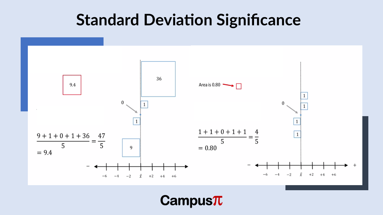
For a dataset with less variability, the data points are not very different from each other, resulting in a smaller total area occupied by these squares. This means that the sum of the squared deviations or distances from the mean will be smaller. In the above example, the sum of the squared deviations from the mean is 9 plus 1 plus 0 plus 1 plus 36 which is 47 and 1 plus 1 plus 0 plus 1 plus 1, which equals 4. Visually, you can see that the area covered by the squares is smaller for the chart in right side than left side.
When you examine a dataset with greater variability, it occupies more space when you sum up the areas of the squares. In simpler terms, for a dataset with more variability, the sum of the squared distances from the mean is higher. This sum, which represents the area covered by the squares after squaring the distances from the mean, encapsulates the extent of variation within the dataset. Conversely, a dataset with less variability would have a smaller sum of squared distances.
To quantify this variation with a single measure, we use the variance, which is calculated by dividing the sum of the squared distances from the mean by the sample size. Importantly, variance indicates the variability present in our dataset.
If we examine the dataset with less overall variability, we see that the total area covered by the boxes is smaller. In this case, the typical box representing the variance has an area of 0.8. In simpler terms, when the total variability is reduced, the variance also decreases. For this example, the total variation, calculated as the sum of squared deviations from the mean (1 + 1 + 0 + 1 + 1) divided by five, equals 0.8.
So, that’s how variance is determined for a dataset. A dataset with higher variability results in a slightly larger box, as seen in this case where the variance is 9.4. The typical box representing the variance for this dataset is 9.4 in area. This calculation remains consistent: total variability divided by the number of observations gives us this value of 9.4.
The variance effectively serves as the average of the sum of squared deviations from the mean. It accurately reflects the level of variability within a dataset: a higher variance value indicates greater variability among observations, while a lower variance value indicates less variability.
Unit of Variance
The units of variance are in squared units, meaning if the original dataset uses miles as units, the variance would be in square miles; if it’s in inches, the variance would be in square inches. This reflects how we calculate variance by squaring the deviations from the mean.
However, this drawback of the variance as it’s presented in squared units, can be challenging to interpret directly in terms of the original unit of measurement. For instance, if our dataset is in Miles, it’s more intuitive to understand variability in Miles rather than Miles squared.
This highlights a key issue with variance: its unit of measure squared makes interpretation less straightforward. Instead, a more practical approach would be to use a measure of variability that directly reflects the original unit of measurement. For example, instead of inches squared, we would prefer a measure based on inches; similarly, for Miles squared, we would prefer a measure based on Miles. A solution to this is to take square root of variance which is also know as standard deviation.