Demo Example
Demo Example
Demo Example
Author

Campusπ

Browsing

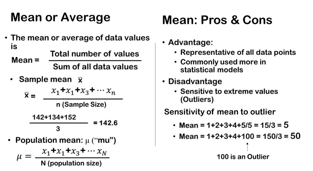
Unlike the mean and median, which represent average and middle values respectively, the mode identifies the most frequently occurring value in a dataset. Calculating the mode is straightforward. You first list all values in the dataset, and then identify which value appears most frequently. This value is considered the mode.

In practice, statistical software is often used to calculate the mode, especially when dealing with large datasets. Just as we rely on software for calculating the mean and median efficiently, using statistical tools ensures accuracy and saves time in identifying the mode, particularly in datasets with numerous observations.

The mode offers valuable insights into the typical or predominant value within a dataset. It’s particularly useful in scenarios where identifying the most common occurrence is important, such as in analyzing consumer preferences, exam scores, or product sales data.

Advantage and Disadvantage
One of the key advantages of the mode is its resilience against extreme values, similar to the median. Unlike the mean, which can be heavily influenced by outliers, the mode remains relatively unaffected. This makes it a robust measure when dealing with datasets that contain extreme values or skewed distributions.

Additionally, the mode has intuitive appeal. It represents the value that appears most frequently in a dataset, aligning with our natural expectation that the center of a distribution should be represented by its most common value.

However, the mode does have limitations. Like the median, it can be challenging to incorporate into more complex statistical models. Statistical techniques and models often rely on the mean due to its mathematical properties and widespread applicability. The mode, while intuitive, is less commonly used in advanced statistical analyses.

Another drawback of the mode arises when dealing with continuous numerical variables. In cases where variables can take on a wide range of values with small differences (like 1.1, 1.2, 1.3 up to 100.1), determining a single mode can be ambiguous or meaningless. The mode is more suited to discrete numerical variables where values are distinct and identifiable.

Mode of survey example

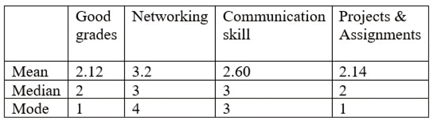
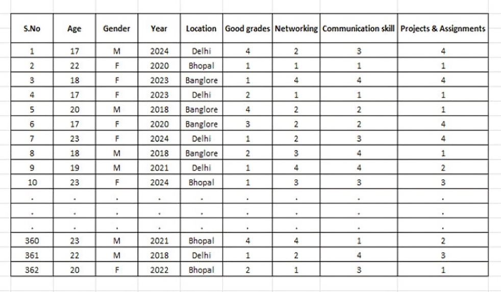
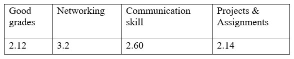
Let’s dive into our example of Key to a great career in data science dataset and determine the mode for each of the variables: grades, networking, communication skills, and projects. The example is common to explain the concept of mean, median and mode, if you have already read the article on mean or median of having a great career in data science you can understand or else you can read it here.

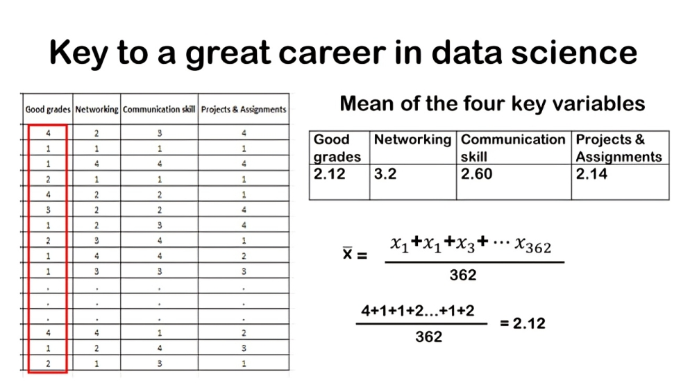
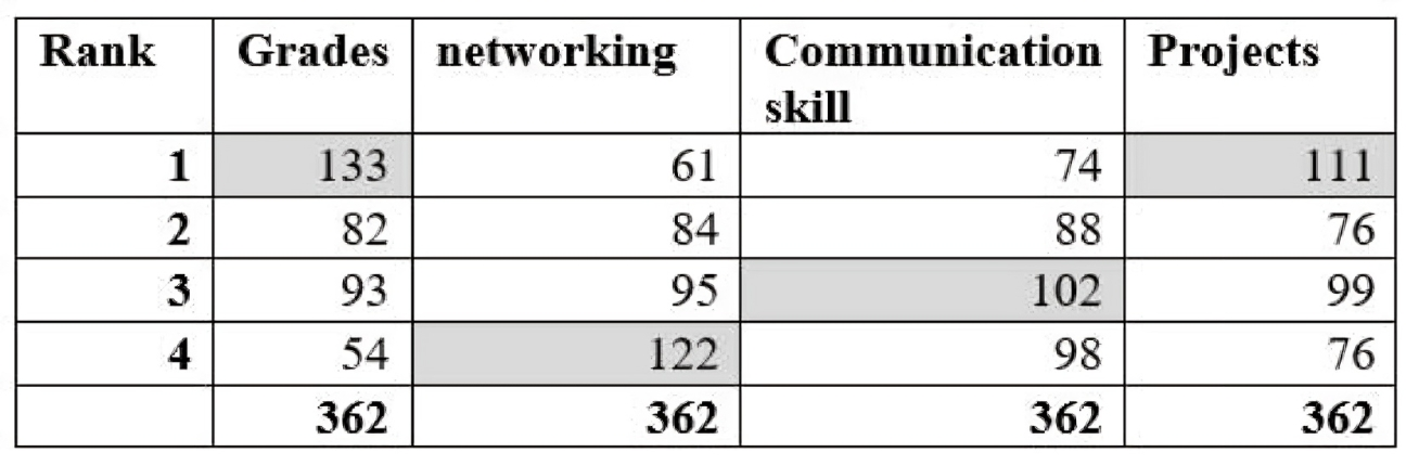
Firstly, for the grade variable, we organize the rankings from least to most common. Students rated grades as follows: 1, 2, 3, and 4. Among these, the most common rating was 1, chosen by 133 students. This makes grades the top-ranked attribute, reflecting its perceived importance. Therefore, the mode for the grade variable is 1.

Moving to networking, the mode is 4. This indicates that among the students surveyed, networking was most frequently ranked as the least important attribute for a successful career in data science.

For communication skills, the mode is 3, suggesting that it was commonly ranked in the middle among the surveyed students in terms of importance.

Lastly, projects also have a mode of 1, indicating that a significant number of students considered practical projects as highly important for a successful career in data science, similar to grades.

This table of modes provides a snapshot of how students prioritize these attributes. It highlights the attributes that are consistently perceived as crucial versus those that are less emphasized according to the surveyed population.

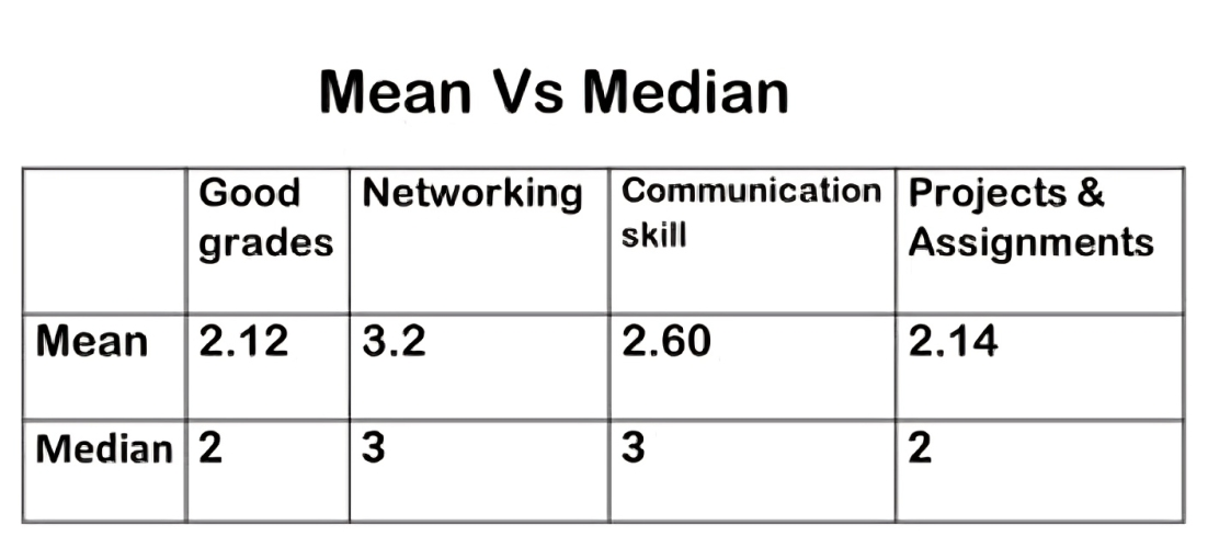
If we look at the mode, we can compare it with the median and the mean. The mean the most important quality was grade, if you look at the median the most important quality was either grade or projects, we have a tie in that case the 50th percentile is two. if we look at mode the least important is networking and it also confirms that the grade is the number one factor that decide a better career in data science. We can see that across all three measures of central tendency across all three calculations we get a similar sort of finding.

We’ve discussed the mean previously about mean or average as a measure of central tendency, let’s explore two other important measures: the median. This measures provide different perspectives on what constitutes a typical observation within a dataset. The median is often referred to as the 50th percentile. It represents the middle number in a dataset when the observations are arranged in ascending or descending order. This middle point divides the dataset into two equal halves, with half of the observations lying below and half above the median. Calculating the median depends on whether the dataset contains an odd or even number of observations:
• If there is an odd number of observations, the median is simply the middle number.
• If there is an even number of observations, the median is the average of the two middle numbers.

For instance, if we have 7 observations, the median would be the 4th observation when arranged in order. If we have 8 observations, the median would be the average of the 4th and 5th observations. The median provides a robust measure of central tendency, particularly useful when dealing with skewed distributions or datasets containing outliers. Unlike the mean, which can be influenced by extreme values, the median remains relatively unaffected by outliers, making it a valuable tool for understanding the typical value or position within a dataset.

Let’s explore the concept of the median further with a practical example. Suppose we have a set of observations: 13, 27, 44, 44, 49, 53, 56, 99, and 100. To find the median, we first arrange these numbers in ascending order: 13, 27, 44, 44, 49, 53, 56, 99, 100. Since we have an odd number of observations (9 in total), the median is simply the middle number, which is 49. This means that half of the observations are below 49 (13, 27, 44, 44) and half are above it (53, 56, 99, 100).

Now, let’s consider an example with an even number of observations: 13, 27, 44, 44, 49, 53, 56, 99. Again, we arrange these numbers in ascending order: 13, 27, 44, 44, 49, 53, 56, 99.

Here, with 8 observations, the two middle numbers are 44 and 49. To find the median, we take the average of these two middle numbers: Median= (44+49)/2 = 46.5. In both cases, whether odd or even, calculating the median involves ordering the observations and identifying the middle value(s). This approach ensures a clear and consistent method for determining the median in any dataset.
When dealing with large datasets, especially those with thousands or millions of observations, statistical software is typically used to compute the median efficiently. Modern tools make it straightforward to find the median or 50th percentile, providing a robust measure of central tendency.

Advantage and Disadvantage
One of the key advantages of using the median as a measure of central tendency is its robustness against extreme values or outliers. Unlike the mean, which can be heavily influenced by outliers, the median remains relatively unaffected. This makes the median a more reliable measure when dealing with datasets that contain extreme values. Another intuitive advantage of the median is its simplicity and interpretability. The median represents the middle value in a dataset, dividing it into two equal parts where half of the observations are lower and half are higher. This straightforward interpretation makes it easy to grasp the central tendency of the data at a glance.

However, the median does have its drawbacks. One significant disadvantage is its limited utility in more complex statistical models. Unlike the mean, which is commonly used in various statistical analyses and models, the median can be more challenging to incorporate due to its simpler calculation and less nuanced representation of the data distribution.

Let’s explore the concept of the median and its resilience against outliers using a example. Suppose we have a dataset with observations: 1, 2, 3, 4, and 5. When calculating the median, we arrange these numbers in ascending order and find the middle value. Since we have an odd number of observations (5 in total), the median is simply the middle number, which in this case is 3. This means there are two observations below 3 and two above 3.

Now, consider if we introduce an outlier into our dataset. Instead of 5, let’s change one observation to 100. So, our dataset now looks like: 1, 2, 3, 4, 100. Despite the presence of the outlier (100), the number of observations remains the same and four out of five values are identical. However, when calculating the median again, it remains unaffected by the outlier. The median still stays at 3.

This example highlights a key strength of the median: its robustness against extreme values or outliers. Unlike the mean, which incorporates information from all data points and can be heavily influenced by outliers, the median focuses solely on the middle value(s) of the dataset. It doesn’t change even if an extreme value is added or modified, as long as the number of observations remains odd.

This robustness makes the median a preferred measure of central tendency in datasets where outliers are present or when the distribution is skewed. It provides a stable and reliable indication of the central value without being skewed by extreme values.

Median explained through survey example
Let’s revisit our survey dataset (link to article 12) where we explored four ranking variables related to perceptions of a successful career in data science. Using statistical software, we’ve calculated the median for each variable without the need for manual ordering or calculations.

Firstly, for the grade’s variable, the median is 2. This means that, in terms of importance, grades are perceived as a central factor among college students, ranking higher relative to other variables.

Next, for networking, the median is 3. This suggests that networking is positioned as a middle-ranking factor in terms of importance for a successful career in data science. While still significant, it may not be as pivotal as other attributes according to the surveyed students.

Interestingly, the variables with the lowest median rankings are grades and projects, both having a median rank of 2. This highlights grades and practical project experience as the most crucial attributes perceived by students for achieving success in data science careers.
These median values provide a snapshot of how students prioritize different aspects when considering their career paths. They offer insights into which factors are perceived as most essential and which ones hold lesser importance.

Mean Vs Median

In earlier article we have calculated mean taking the survey example. Let’s compare the mean and median values for our survey variables related to perceptions of a successful career in data science. Both mean and median serve as measures of central tendency, offering insights into which attributes students deem important.

Starting with grades, both the mean and median indicate that good grades are perceived as the most crucial factor for a successful career in data science. This consistency suggests a strong consensus among students regarding the significance of academic performance.
When we look at the other variables, networking emerges as the least important according to both measures. Communication skills ranked slightly higher but still less essential compared to grades and projects.

Speaking of projects, it’s notable that the median ranks projects as equally important as grades. This implies that, on average, students view hands-on project experience as equally significant as academic achievement when considering career success in data science.
It’s important to note that while the mean and median provide similar findings, they do show slight differences in how they rank the importance of grades versus projects. The mean may show a slight distinction between these two variables, whereas the median treats them equally due to its nature as the middle value in an ordered dataset.

Overall, whether we analyze using mean or median, the key takeaway remains consistent: good grades are paramount for a successful career in data science, followed closely by practical project experience. This alignment in findings scores the critical role of academic achievement and hands-on learning in shaping career aspirations in the field.

To better illustrate the concepts of mean, median and mode, let’s dive into an example survey about what makes a great career in data science, according to undergraduate students. Imagine we surveyed college students, asking them to rank four key parameters they believe are essential for aspiring data scientists. The options they had to rank were: good grades, networking, communication skills, and projects & assignments. By analyzing their responses, we can uncover valuable insights into their perceptions and priorities. Let’s see how mean can help us make sense of this data!

Take a look at this intriguing dataset featuring responses from 362 students—our entire sample size. With 362 rows, each representing an individual student’s input, we dive into various insightful details. The columns reveal a wealth of information, including:
• Age: How old are these future data scientists?
• Gender: Who’s making strides in this field?
• Year of Study: Where are they in their academic journey?
• Location: Where are these students based?

But that’s not all! We’ve also asked these students to rank four key parameters that they believe are crucial for a successful career in data science.

Column Breakdown
But before that let’s categories our variables. Pls, recall we have discussed two kinds of variables in our first class numerical and categorical.

Age: This is a numerical discrete variable. Think of it as the non-negative counting numbers we’ve discussed in class.

Gender: Here, we have a nominal categorical variable. It captures whether a student identifies as male or female, but there’s no ranking involved—it’s purely descriptive.

Year of Study: This one’s an ordinal categorical variable. It tells us which year the students are in—1st, 2nd, 3rd, or 4th. There’s a clear order, reflecting their academic progression.

Location: Despite our earlier discussions, let’s clarify—location is a nominal categorical variable. It indicates whether a school is in a rural, urban, or suburban area, but there’s no inherent ranking among these.

The Final Four Columns: These are where things get really interesting. Each student has ranked four key parameters essential for a successful career in data science. These parameters are:
• Good Grades
• Networking
• Communication Skills
• Projects & Assignments

Each student assigns a rank to these parameters, from 1 to 4. So, the final four columns are numerical discrete variables, capturing the students’ priorities in building a stellar data science career.

Mean of survey variables: Key to great career in data science

In this data set many of our variables are numerical not categorical? While we do have a few categorical variables like gender, year of study, and location, the majority of our columns—like age and the ranking variables—are numerical. Numerical data can take on many different values, making it a bit more complex to describe and understand compared to categorical data.

A natural question arises: What is the average ranking for each of these variables? Essentially, we want to understand, on average, how students prioritize these aspects. Are grades considered most important, or do networking, communication skills, or project experience take precedence?

To answer this, we can calculate the mean ranking for each variable. By computing the mean, we obtain a clear numerical summary that reflects the average perception of students regarding the importance of each factor.

Result of survey
Let’s delve into the results from our dataset regarding what students consider important for a successful career in data science. We’ve analyzed four key variables: grades, networking, communication skills, and projects, each representing how students rank these factors from most to least important.

Starting with the grade variable, we used statistical software to calculate its mean ranking, which turned out to be 2.12. This means that, on average, students rank grades among the top two factors they deem crucial for success in data science. Remember, a lower numerical ranking signifies higher perceived importance — with 1 indicating the most important and 4 the least.

Next, let’s consider networking. The average ranking for networking was found to be 3.2. This suggests that, on average, students view networking as moderately important compared to other factors in the realm of data science careers. Moving on to communication skills, the mean ranking obtained was 2.60. This places communication skills slightly higher than the midpoint of importance among the factors examined.

Lastly, for projects, the average ranking was calculated to be 2.14. This indicates that students generally prioritize hands-on project experience as one of the more important factors for achieving success in data science careers.

These mean rankings provide valuable insights into student perspectives and priorities within the field. They highlight the varying degrees of importance placed on grades, networking, communication skills, and projects. Such insights are crucial for educators, career advisors, and industry professionals seeking to understand and cater to the needs of aspiring data scientists.

To clarify, if we use the mean as a measure of central tendency, grades emerge as the highest-ranking factor in terms of perceived importance for a successful career in data science.

Mean is the one of the most commonly used measures of central tendency. It’s a powerful tool for understanding the typical value in our data, showing us where the center of numerical variables lies. Let us take an example to calculate mean weight. The mean weight is simply the total weight of all individuals divided by the number of individuals. This gives us a sense of the “average” weight. Let’s take an example how we calculate the mean, or average, weight of three students—Ryan, Pushkar, and Dravid. To find the mean of the three students, we add up all the weights and divide by the sample size which is three, we get 142.6 pounds as shown in the above figure.

When we talk about the mean or average, we’re referring to the same concept. In statistics, it’s a fundamental measure of central tendency, helping us understand what the typical value is within a set of observations. By using simple arithmetic—summing up the observations and dividing by the number of observations—we can easily find the mean.

Notation
It’s important to discuss the notation when summarizing data. Generally, when dealing with dataset we deal with hundreds of data node, it can become quite cumbersome to manage if we keep track of individual responses. This is where notation becomes incredibly handy. Instead of tracking each parameter, we use concise notation to streamline our analysis. This method is not only efficient for our dataset but also essential when dealing with datasets containing millions of observations.

When we talk about the mean or other measures, we collect different observations for a variable, which we can call it X. Suppose we have three students—Ryan, Pushkar, and Dravid. Instead of repeatedly writing their names, we use subscripts to label each observation:
x_1: Observation for Ryan
x_2: Observation for Pushkar
x_3: Observation for Dravid

This concise notation allows us to easily reference specific data points. For instance, when we mention x_3, we know we’re talking about Dravid’s weight. Using this notation, we can quickly refer to any student’s data and their corresponding values. This makes our analysis much smoother. With this shorthand notation, we can easily handle massive datasets, making it possible to perform complex analyses without getting bogged down by individual details. This approach allows us to focus on the big picture and derive meaningful insights from our data.

Samples vs. Populations
In statistics, it’s crucial to distinguish between a sample mean and a population mean. Recall that a sample is a subset of a population. There is a complete article that discusses the nuance of sample and population which can be found here (link to article 3). Statisticians and data analysts often work with samples because they’re easier and cheaper to collect compared to an entire population. Conducting a census for a population is costly and time-consuming. Therefore, much of statistics involves taking a sample from a population and making inferences about the population based on that sample.

So, coming back to mean if data set of observations is a sample, then we call the mean x ̅ (pronounced as X bar). It’s just an X with a line over this is just by convention. If the data set is a population then we call the mean µ, this is a Greek letter mu. The important point is that in general when we talk about population parameters and versus sample statistics the population parameters are expressed in Greek letters typically and the sample statistics are represented in Latin or Roman letters.

Mean of a sample vs population
Understanding how to calculate means from samples versus populations is essential in statistics. Although the formula remains the same, the notation differs slightly, which clarifies whether we’re working with a subset or the entire dataset.

When calculating the mean of a sample, denoted as x ̅, you sum up all the observations (represented as x_i, where i ranges from 1 to n, and n is the sample size), and then divide by the sample size, n. This gives x ̅, which represents the average value of sample.

On the other hand, when dealing with populations, we use a different notation. The total number of observations in a population is denoted by capital N. For example, if we’re measuring the weight of all 160 billion people in India, N represents the total population size.

To find the population mean, denoted as mu (μ), we follow the same process: sum up all the observations across the entire population and divide by the population size, N. This results in the population mean, μ, which represents the average value of the entire population.

This distinction in notation—using small n for sample size and capital N for population size—helps to clearly differentiate between working with a subset of data versus the entire dataset.

Advantage & Disadvantage of mean
The mean, as a measure of central tendency, offers several advantages that make it widely used in statistical analysis. Primarily, it provides a single numerical summary that incorporates information from all data points within a dataset. This characteristic makes the mean highly representative of the entire dataset, offering a clear and concise average value.

Moreover, the mean holds universal applicability across various statistical and data analytic methods. Its widespread use from its simplicity and effectiveness in summarizing data, making it a fundamental tool in statistical inference and decision-making processes.

Drawbacks
However, despite its popularity, the mean has notable drawbacks, primarily its sensitivity to extreme values, also known as outliers. When an outlier—such as a significantly larger or smaller value compared to the rest of the dataset—is present, the mean can be heavily influenced. This sensitivity means that the mean may not accurately reflect the typical or central value of the dataset when extreme values are present.

To illustrate this sensitivity, consider an example where a dataset has values of 1, 2, 3, 4, and 5. Calculating the mean without the outlier gives a value of 3 (1+2+3+4+5 = 15; 15 / 5 = 3). However, when the outlier (100) is included, the mean shifts dramatically to 22 (1+2+3+4+100 = 110; 110 / 5 = 22). This stark change demonstrates how the mean can be skewed by just one extreme value, affecting its reliability as a measure of central tendency in such scenarios.

In conclusion, while the mean offers a straightforward and widely applicable measure of central tendency, its susceptibility to outliers underscores the importance of considering other measures—such as the median or mode—depending on the distribution and characteristics of the dataset. Understanding these nuances is crucial for making informed decisions and interpretations in statistical analysis.

Describing Numerical Data
In the previous articles we described two kinds of variable numerical and categorical, also known as quantitative or qualitative variable. The article can be found here. In another article we also saw how do we describe categorical variable though table of count, contingency table which can be found here. We discussed how we can visualize two categorical variables, through staked and dodged chart and through mosaic plot which can be found here. Now, it’s time to tackle numerical data! This article focuses on how do we describe numerical data? To really get a grasp on numerical data, we use measures of center and location, along with some graphical techniques.

Imagine you’ve got a bunch of numbers from a survey or an experiment. How do you make sense of all this data? That’s where descriptive statistics come in. To describe the numerical data, we measure the center and location: the mean, median, and mode. Then, we also use percentiles and quartiles, which give us another way to understand the location of our data points. Next, the measures of variation or spread, determine if our data is scattered or tightly clustered. Finally, we’ll bring our data to life with visualizations, learning how to create and interpret histograms, box plots, and density plots.

Measures of Center: The center of our numerical data helps us identify the typical values. We do this by looking at:
• Mean: The average value, giving us an overall trend.
• Median: The middle value when data is ordered, showing us the central point.
• Mode: The most frequently occurring value, highlighting common trends.

Measures of Location: We also use other measures of location to dig deeper:
• Quartiles: These divide the data into quarters, providing insight into data distribution.
• Percentiles: These show the relative standing of a value within the dataset.

Measures of Dispersion: Understanding how spread out the data is helps us grasp its variability:
• Range: The difference between the maximum and minimum values.
• Interquartile Range (IQR): The range of the middle 50% of the data, offering a focused view of data spread.
• Variance and Standard Deviation: These are crucial for understanding how much the values deviate from the mean.

Visualizing Numerical Data: For numerical data, we use different visualization techniques:
• Histograms: To show the frequency distribution of data.
• Box Plots: To display the data distribution, highlighting the median, quartiles, and potential outliers.

In the previous article we discussed how to visualize two categorical variables through dodged, staked bar graphs. Another way of visualizing a two-by-two table is through a mosaic plot. A mosaic plot can help you to visualize the unconditional and conditional aspects of a contingency table. So, there are two steps to construct a mosaic plot.

First, you just create a square and that square is divided into two vertical bars. There would be as many vertical bars as the number of categorical variables. You should have the same number of vertical bars as you have levels of a categorical variable. The width of these vertical bars is proportional to the unconditional distribution of a categorical variable. So, if you have two levels of a categorical variable then you have two bars.

The next step is we split each vertical bar horizontally proportional to the conditional distributions of some other variable. It’s really important to note that, when you create a mosaic plot, keep track of what you’re conditioning on, as it will change the whole graph.


For better understanding let’s go through an example, so first we’re going to take a square and we’re going to divide it into vertical bars, whose widths are proportional to the unconditional distribution of the first categorical variable.

So, our first categorical variable is gender. If we look at the percentage, we can see that 63 percent of people are female and 37 are male.

We divide the square vertically in two columns as there are two categorical variables, male and female. Then we create square proportional to the width of the vertical bar for those in the female category, it’s going to be a little bit larger. because we have 63% of female as the unconditional distribution. We can see that this blue bar it’s a little bit larger in term terms of its width because 63 percent of people are females and then the orange bar for male is a little bit narrower.

This completes our first step; we we’ve created a square and divided the vertical bars equal to the number of levels for our first categorical variable. Also, the width of each bar is proportional to the unconditional distribution of the first categorical variable.

Conditioning on gender

In the second and final step, we split each bar horizontally, proportional to the conditional distributions of the row categorical variable. so, our row categorical variable is going to be relationship status at three levels. We’re going to look at the distributions of relationship status, conditional on whether you are female or male. This is just reflecting the different conditional distributions of class.

You can see here that the two vertical bars are reflecting the unconditional distribution of whether you are female or male, and the horizontal splits we have a different distribution of whether you are in a relationship, in a complicated relationship or single, conditioned on whether you are female or male. A greater percentage of people are who are single are female (59%). We can see this visually in the Mosaic plot it’s reflecting the distribution of relationship status conditional and gender. The great thing about a mosaic plot is it conveys a lot of information in a relatively concise way.

So, to conclude again on a mosaic plot, the width of the bars or the column variable gives the unconditional percentage or unconditional distribution, that visually reflect in the mosaic plot and we can see that overall, more people are female than male. Vertical splits is the conditional distributions, you can say that among those who are female a greater percentage are single.

Conditioning on relationship status

In the previous case we were conditioning on gender, now we are on relationship status. We can also make a mosaic plot by flipping the column and row variables. So, in that case the relationship status will be the unconditional distribution and then the gender in the row variable as conditional distribution. So as previously we will divide the square in three columns as in a relationship, it’s complicated, single as they represent the unconditional distribution. As a next step we split the columns horizontally as the conditional distribution of gender.

So, in this case also we can make conclusions as well, we’re just conditioning on a slightly different variable i.e. relationship status. We can conclude that overall, a greater percentage of female are single. Also, we can conclude that female have a higher percentage of being in a relationship than male.

The row variable is giving us a set of conditional distributions, so it’s really important when you create a mosaic plot to keep track of what you’re conditioning on, are you conditioning on relationship status or you’re conditioning on gender. The distribution of gender conditional in relationship status is in fact not the same as the distribution of relationship status conditional on gender. Or as posed earlier we can ask among those who are female, what percentage of people were single than complicated relationship which will reflect conditioning on gender. And the next will be among those who were in relationship, what percentage is male? so always ask yourself what am I conditioning on what are these percentages or proportions of that I’m calculating.