Demo Example
Demo Example
Demo Example
Author

Campusπ

Browsing

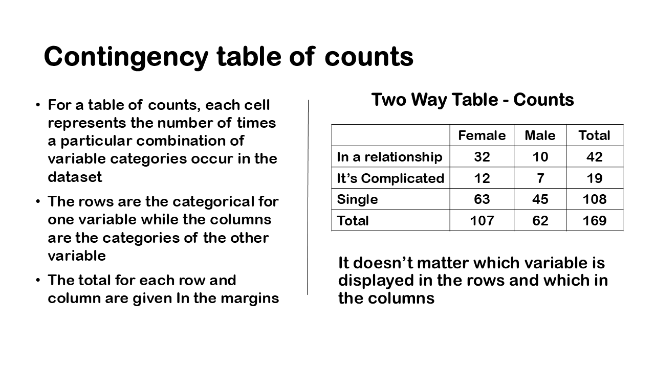
Bar Graph-two categorical variable

In the previous article, we have discussed tabulating and graphing one categorical variable through table of count and proportion. We also discussed in another article about tabulating two categorical variables through contingency table. We also saw in another article how the conditioning matters through conditional and marginal distributions by taking example of relationship status and gender. So, in this article of categorical data, we will discuss how to visualize categorical data. We will talk about dodged, staked bar graphs. We will also discuss what is called a Mosaic plot in another article? To visualize the two categorical variables, we use both dodged and stacked bar graphs. Bar graphs can be used to display relative frequencies or proportions or percentages but here we will focus on bar graphs of counts.

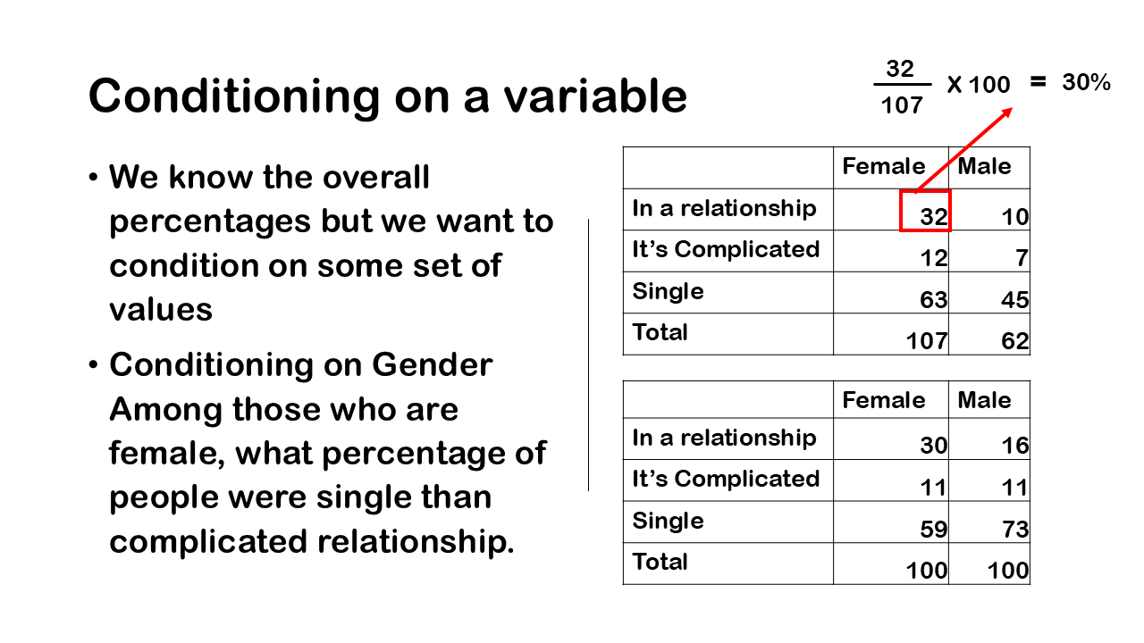
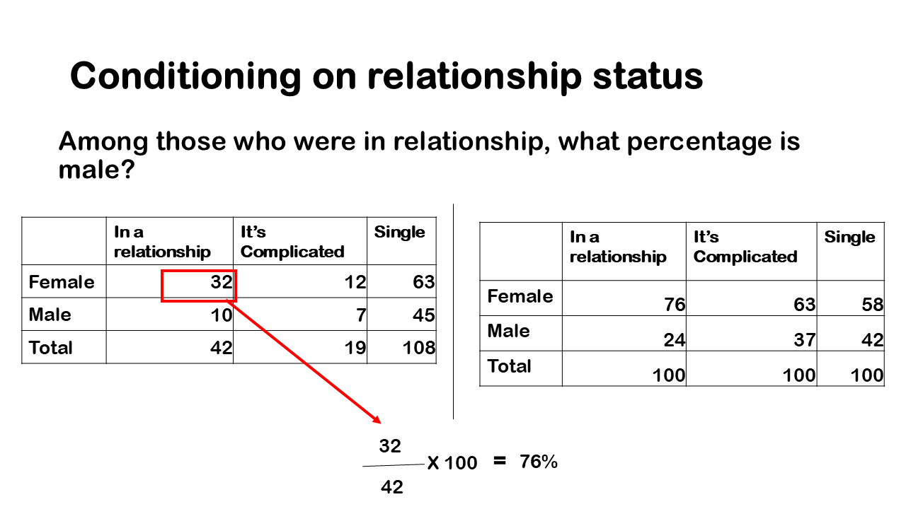
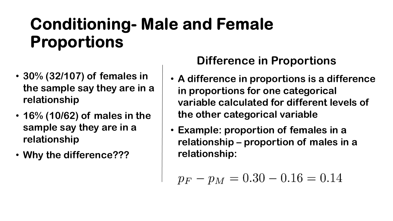
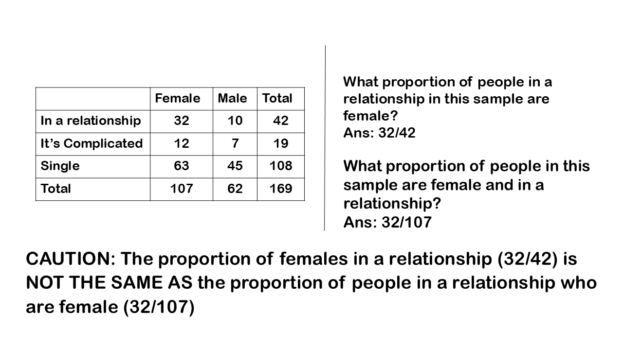
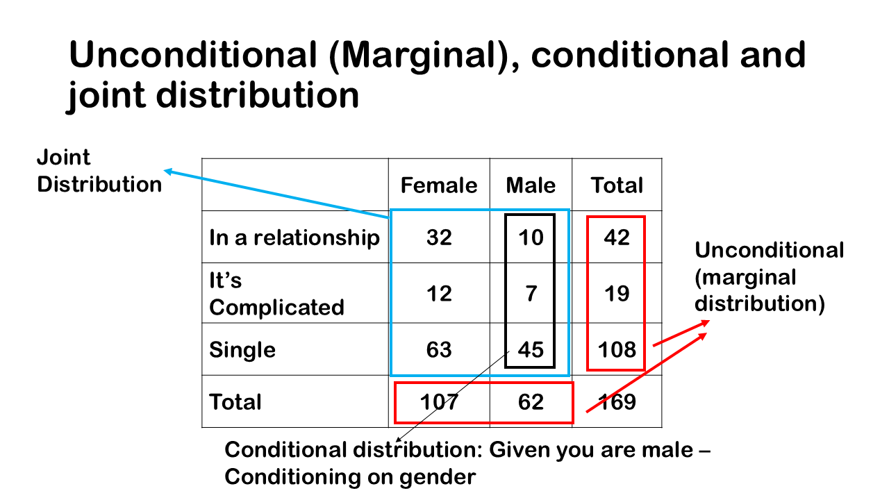
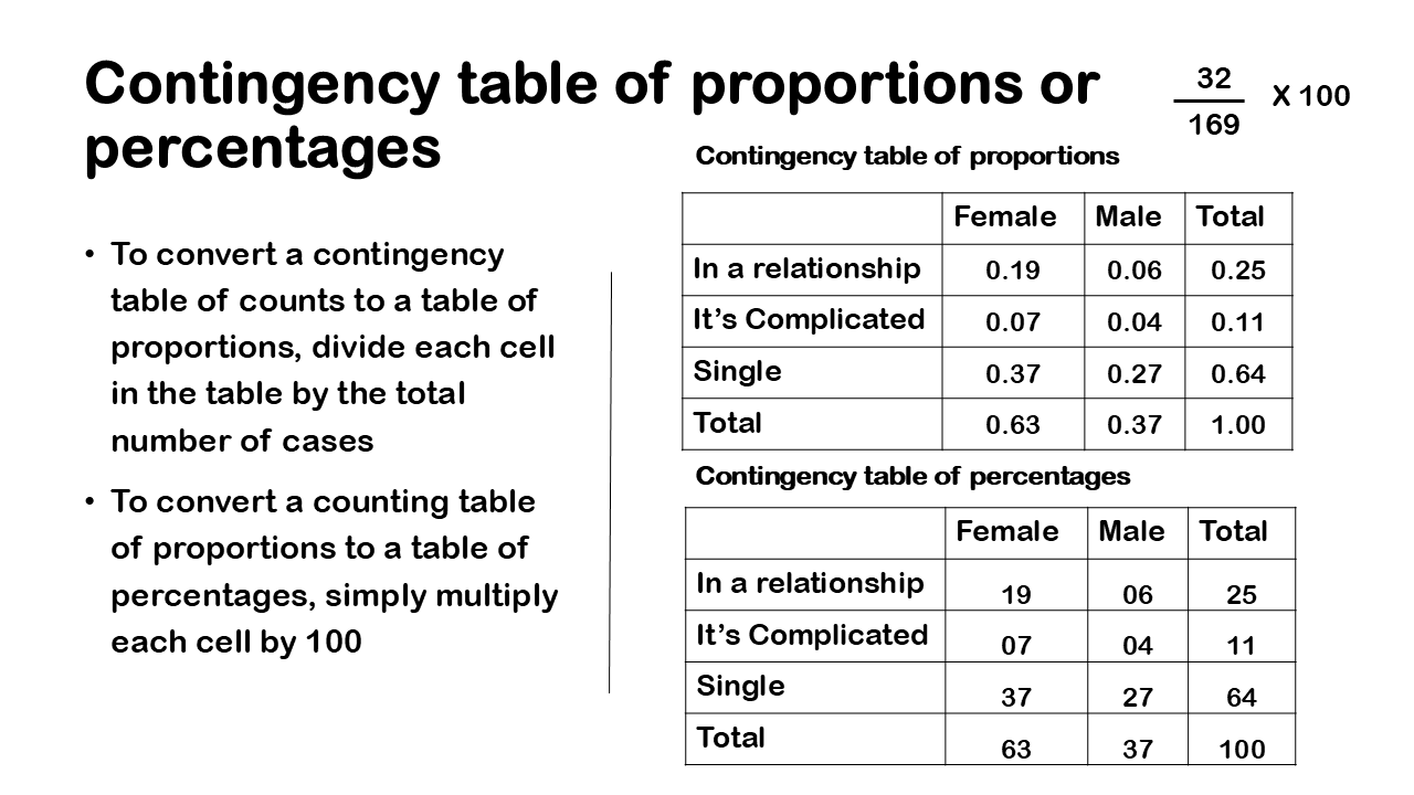
Referring to our contingency table of counts we have 169 total number of people. We also have the total counts for those in a relationship, in a complicated relationship or single and total counts of female and male. And then, we have the cells of this contingency table which are the different counts at different levels. So, for example we have 32 people who are in relationship and are female. Then we have 10 people who are in are in relationship are male.

So, for a contingency table of counts, we can think of graphing the marginal or unconditional distributions using a simple bar graph which is displayed. The bar graph is showing the unconditional distribution of those who are female and male. Across the other categorical variable of relationship status, we have three level of those who are in a relationship, in a complicated relationship or single.

Overall, 42, 19, 108 people that’s shown in this bar graph for relationship status, and 107 and 62 as male and female. So, reiterate again, these are the frequencies or counts for the unconditional distributions

Dodged bar graph -side by side bar graph

Plotting the total unconditional distribution is straight forward as we have seen earlier. The above graph shows clearly how to plot these distributions. The question we have is these cells in the middle highlighted in red box that reflect the cross tabulation of the different values for a categorical variable, how do we graph. The solution is to create a bar graph that are either dodged or stacked

Gender with relationship status

Let’s look at a dodged bar graph, this is a bar graph in which we’re looking at those who are female and those who are male and then among those who are female or male, we’re looking at the counts for whether you’re in a relationship, in a complicated relationship or single. We call this dodged Because the actual bars are compressed next to each other, or side by side.

We can see that all we’re doing is we’re just representing the cells here. We have six cells and we have six bars, we’re just grouping the bars based on whether you’re female or male. When looking at these cells, we know we have different heights and we can see that most people in our data set are those in the group, who are female and single, that’s the highest bar out of these cells. We can also look at a different sort of way of creating a dodged bar graph instead of grouping by whether or not you are male or female.

Relationship status with Gender

We can also group the cells based on whether you’re in a relationship, in a complicated relationship or single. This is the same kind of graph as before the heights of the bars are the same, we’re just orienting whether or not you are female or male versus the relationship status. In this case we’re just chunking our data into whether you’re in in a relationship, in a complicated relationship or single than with an each of those levels or categories, so we have three columns rather than two in previous example and those three levels are again bifurcated into whether you are male or female.

It’s just a slightly different way of looking at the data, but we’re doing is we’re just representing the counts or frequencies in the cells in a contingency table and the heights of the bars, just still representing the number of counts for each of those cross tabulations

Stacked bar graph – Gender with relationship status

Now besides dodged bar graphs, we can also think about stacking the bar graph i.e. instead of looking at side by side, we just stack them on top of each other. In this case also what we’re doing is we’re just representing the cells of a table of counts as different bars.

As in the previous case, we’re creating a stacked bar graph in which we’re chunking our data into female or male and then we’re plotting as within each bar the number of counts for those with the relationship status.

So, you can see here that again the greatest bar is represented by females who are single, that just reflects the same information in a dodged bar graph, but sometimes a stacked bar graph can be more informative or just a more concise way of visualizing the cells.

Relationship status with Gender

We could also look at a stacked bar graph by just chunking the relationship status as in the previous case. So, we’re looking at relationship status first, and then within each level we’re looking at the number of counts who are female or male. Both the graphs dodged and stacked conclude the same thing. Also change in the orientation of the graph will also not change anything, it’s just a different way to represent the data.

Previous article discussed the basic contingency table of proportions and percentages. People often want to ask more about relationships between these two categorical variables more explicitly. To put another way, we want to know the percentages, conditioning on particular values. so far, we know the overall percentages and we know the percentages for particular combinations but we want to condition on some set of values to and calculate the percentages. Contingency table is called contingency table because often you want to condition or you want to say things that are contingent upon the values of another variable.

For example, someone might pose a question that, among those who are female, what percentage of people were single than complicated relationship. This is conditioning on gender. In a similar way but in a different way we might condition on relationship status, so you might say among those who were in relationship, what percentage is male?

So, let’s look at a contingency table in which we’re conditioning on Gender, what we do is we divide the cell counts by the corresponding total for each category of the gender, i.e. male and female and then we multiply by 100, this will give us the percentages. so, you can see that we have the total for female category i.e., 107 people who are female and 62 people are male and when we divide each cell by its respective column total, we get these percentages.

We divide for those who are in the relationship is 32, the total overall of those who are female is 107. In a similar way we know that 11 percent were in a complicated relationship both male and female. We’re just taking the cell counts for that for a particular cell and we’re dividing by the total number of counts of people who are female.

To answer the question that we pose earlier, among those who are female, what percentage of people were single and what percentages are in complicated relationship, 59 % are single and 11% are in complicated relationship as it is clearly visible from the above figure.

Two categorical Variables – Conditioning on relationship status

We can take a different approach and condition on relationship status; what we’ll do is we’ll divide the cell counts by the corresponding total for each level of class and then multiply by 100.

Let’s go through a few examples what we’ll do is we’ll take the cell count for this particular combination which is 32 and divided by 42 and that is just the total number of observations overall, of those people who are in relationship. This will tell us among those who were in a relationship and are female, when we are conditioning on class.

To answer the question, among those who were in relationship, what percentage is male? We can see that only 24% are male. While the previous table has just 16 % are male and are in the relationship. The difference is because it all depend on the conditioning whether it is relationship status or gender.

Conditioning on relationship status – Percentages
If you are in a relationship, it is 76% chance that you are female, also if you are female, then you have 30% chance of being in relationship which is higher than male as we have seen previously when conditioning on gender. The results differ as whether we are conditioning on relationship status and gender but gives the same conclusion. This led us to conclude that females are likely to be in are relationship or have greater chance of finding the life partner than male counterpart. There is a relationship between gender and their relationship status. Both the variables are not independent.

Difference in proportion

We can also calculate the difference in proportion, if you look at the previous table, 30% of females in the sample say they are in a relationship while only 16% of males in the sample say they are in a relationship. There is a difference. The difference in proportions is a difference in proportions for one categorical variable calculated for different levels of the other categorical variable

Example: proportion of females in a relationship – proportion of males in a relationship: 0.14

Again, to reiterate it, there is a difference when we ask, what proportion of people in this sample are female and in a relationship? And when we ask What proportion of people in a relationship in this sample are female?
Ans: 32/107

What proportion of people in a relationship in this sample are female?
Ans: 32/42

We can have a word of caution here as the proportion of females in a relationship is NOT THE SAME AS the proportion of people in a relationship who are female!

Distribution

Now it’s a good time to discuss, what a distribution is? A distribution is simply the arrangement of values of a variable showing their relative frequency meaning the proportions or percentages. We think of the distribution all the time, imagine have a group of 10 friends and you ask about their favourite ice cream flavor. The possible flavors are Vanilla, Chocolate, and Strawberry. A bar chart or frequency table can visually represent this distribution, where each bar represents the number of friends who prefer each flavor.

You can talk about a distribution that is unconditional or marginal, joint or conditional. so, when we look at these contingency tables it’s useful to talk about it in a way that it references the idea of these type of distribution.

Unconditional (marginal), joint and conditional distribution

Above figure depicts an unconditional distribution or marginal distribution of that we’ve highlighted. Pls keep in mind that they are in the margin and hence called marginal distribution.

The Joint distribution is at the left side of the plot and is given by particular cells jointly.
At the bottom, we have conditional distributions are given here the distribution of relationship status, conditional on whether you are male or female. The highlighted box in red is conditioned on male. In the similar way we can also condition on the relationship status shown in the extreme right of the table in red box.

The whole point about these distributions is that it can be used to examine the relationship between two categorical variables, when there’s a relationship between two variables, we say that the two variables are not independent.

So, let’s look at another example to understand tabulating the two categorical variables. In previous article we have described presenting one categorical variable. The question that we might pose is, is men more likely to be in a relationship or its easy for female to find a life partner. One way to answer these kinds of answers is through contingency table.

So, to understand this we have two categorical variables. The two categorical variables in this example are relationship status and gender. For plotting two categorical variables, contingency table (or cross tabulation) is drawn which is just a table of counts, proportions, or percentages from two categorical variables. Both the categorical variables are plotted across columns and rows.

It’s called a contingency table because it can tell us how cases are distributed along each variable contingent (or conditional) on one or more categories of the other variable. To analyze what’s going on a contingency table it’s just a cross tabulation; it’s simply a table of counts or proportions or percentages from two categorical variables.

The relationship status can be categorised in three categories- in a relationship, complicated and single. These categories are across the rows of the dataset, while gender which have male and female are in the columns of the dataset. It doesn’t matter which variable is displayed in the rows and which in the columns. As in case of one categorical variable, each cell in contingency table represents the number of times a particular combination of variable categories occurs in the dataset.

Contingency table of counts

So, here’s a table of counts a contingency table of counts that displays total number of males 62 and females 107. Each cell in this contingency table will represent the number of times a particular combination of variable categories occurs in the data set and the rows of a contingency table of counts the other categories for one variable and the columns are the categories of the other variable. One thing to keep in mind is that the totals for each row and column are given in the margins

The row variable is labelled and its relationship status and then the column variable is whether or not the person is male or female. we also have the categories or levels of the variable class in the middle. You can see in the figure that we have cell counts for each combination of the categories. The row and column total gives the total no of cases in the dataset. Also, each combination of two categorical variable in the middle gives the total no of cases in the dataset. For example, if you just look at the row for the level in a relationship and the column female you can see that we have 32 females in our data set who were in a relationship.

Contingency table of Proportion

You might also encounter a contingency table of proportions or percentages. It’s useful to express a contingency table in this way because people want proportions or percentages when they’re looking at these tables. To convert a contingency table of counts to a table of proportions, divide each cell in the table by the total number of cases. To convert a counting table of proportions to a table of percentages, simply multiply each cell by 100.

So, here’s an example of converting from Counts to proportions all we’re doing is we’re taking the count for the cell, we have 32 observations and we divide by the total number of observations i.e. 169 and we get this proportion of 0.19. To convert from proportions to percentages again we just multiply the proportions by 100. So, we can say that 19% of people are in a relationship and female. To summarise the table, we can say that most of the people in the survey were single 64 percent. Also, the percentage of female in the survey is more than male, 63 % vs 37%.

Another sort of conclusion we can make is about the sort of joint combinations of the levels of the two categorical variables. We can say for example that 37 percent of females are single versus 27 percent of male who are single. To give another example, 7% of female are in complicated relationship vs 4% as male.

This kind of tabulation can really guide us or sort of provide an impetus to answering certain questions. So, in these kinds of questions, we can use tables and graphs in particular is contingency tables.

To answer questions that we posed earlier at the beginning of the table were men more likely to be in a relationship or its easy for female to find a life partner. We can see here for men its 6% vs female have 19% chances of getting a life partner. So, answer second question, were people in a complicated relationship are more than those who are single? we can see that people who are in complicated relation are 11 % vs those who are single.

If you have a sample or population of data and you want to understand the different properties, the different relationships among the variables in your data then you need to summarise and visualise it, that’s what descriptive statistics is really all about. Categorical variables deal with the characteristic or traits of the variable i.e., data at hand, generally represented in the column of the dataset.

This article focuses on categorical data, i.e., the different ways to study it both in terms of tables and graphical displays. We will start our journey with tabulating one categorical variable called frequency tables, these are just tables of counts. Later on, we have discussed about tabulating two categorical variables through contingency tables, this is when we have two categorical variables and we are just looking at a cross tabulation of counts or frequencies. We will also discuss way of graphing both one and two categorical variables. We also use mosaic plots for two categorical variable which are quite impressive and handy in graphing the two categorical variables.

This article covers the basic concepts of describing one and two categorical variables. In case of one categorical variable, it discusses summery statistics like proportion, frequency table and relative frequency table. The next portion in one categorical variable discusses bar chart and pie chart. To summarise two categorical variables, it discusses two-way table, difference in proportion and finally it visualizes two categorical variables through side-by-side bar chart, segmented bar chart and mosaic plot. The article is well suited for students, professional, educators and individuals who are just starting out in statistics and data science and wanted a solid grasp in the key fundamental.

Categorical Variable: Frequency Tables of counts
Categorical variables are variables that have values with different categories or qualities sometimes they’re called factors and the different categories are called levels. We have gone through some of these examples before like gender, respondent, approval or disapproval of a social policy, whether or not your regular smoker in our previous session. If you haven’t gone through the article, here is the link.

So, let’s take an example for better understanding, A random sample of adults were surveyed regarding the type of car they own among the four cars Hyundai, Maruti, Tesla, Mercedes, ford. Now we can raise some questions you might ask you know how many people have Mercedes, what proportion of passengers have ford. These kinds of questions where when you look at particular rows of a data set that can really prompt investigation of various ideas.

so, to answer these kinds of questions we will want to create tables and graphs for a single categorical variable, one way to really create a table of counts is through frequency tables a frequency table is just that it’s you take a categorical variable and you just calculate the counts of observations for each category. Frequency is just a fancy word for count so if you ever hear the word frequency you think counts, you’re just counting up how many in each category in terms of observations. So right now, I want us to focus on how many people have ford? So, we can look at the frequency table and say that 42 people have ford and 65 people have tesla and so on.

Relative frequency table of proportion and percentages

Besides the table of counts you can also create what’s called a relative frequency table sometimes a relative frequency is more useful than frequency table. So, a relative frequency is simply a proportion or percentage of each category, so to calculate the proportion you just divide the counts by the total number of cases and then that will give you the proportion. But usually, we want to multiply by 100 because often people like to express proportions as percentages. We call this a relative frequency table and it’s simply a table that gives the categories of a categorical variable and it gives the proportions or percentages of observations for each category.

So here is the example of the no. of people who have different cars in proportion. Please note that the all the numbers in a relative frequency table sum to 1. To express proportions as percentages so the way you do that is you simply multiply the proportions by 100.


so, let’s examine our research questions in the context of creating these relative frequency tables you might say what percentage of people have different types of cars. You could just create a relative frequency table of percentages in terms of the question. You may also ask what percentage of people have no cars? So, you can see that these research questions are quite easily answered through a collection of data and then this kind of basic analysis where you create a table of counts proportions or percentages.

Graphing one categorical variable

Now besides tables it’s often useful to visualize a categorical variable. To Really visualize a single categorical variable, it’s very common to either use a bar graph or a pie chart. Bar graph is usually preferred by statisticians; a bar graph shows the bars whose areas are representing the count of observations for each category of a categorical variable.

A pie chart basically shows how a whole is divided into categories and it shows wedges of a circle and each wedge has an area corresponding to the proportions for each category. These are the most common charts used throughout the academia and industry.

The above picture shows a bar graph, this is a bar graph of counts. So, it’s a frequency bar graph and I’ve presented the frequency table for comparison and you can see that the bar graph just duplicates the findings from the frequency table but sometimes it’s useful just to visualize the difference especially to really understand the differences between the number of observations in each category.

A pie chart shown above is based on a frequency table of counts but the wedges give you an idea of the relative proportion or percentage. A pie chart is replicating the bar graph of frequency counts you do see in the above figure that highest number of people have Maruti.

In a bar graph you can really easily compare the heights of the bars; with the pie chart it can be pretty difficult to really compare the relative sizes especially when the categories are pretty similar. The number of counts or the relative size of the counts meaning the proportions or percentages. I just want to emphasize that if you’re showing a table of counts or frequencies to a statistician or an expert it is better to present a bar graph.

you can see that in the bar graph it’s quite clear that highest number of people have Maruti and then the next highest category is Tesla. On the pie chart the difference between the Hyundai, ford and Mercedes is quite difficult to distinguish given the counts are removed. On the bar graph even, the counts are similar can still distinguish between the three categories meaning it’s you can still tell that there are more people in Hyundai, the pie chart. It really kind of washes that over this is why bar graphs are typically favoured by statisticians and experts in data visualization.

There are two main kinds of studies, observational studies and, experimental studies. The statistical process can be viewed in the context of this General process of Investigation that we talked about earlier. The four steps comprise: identifying a question or problem, collecting relevant data, analysing the data and making a conclusion. Study design helps us improve the collection of data, it makes collecting data transparent and also helps us to understand what kinds of inferences or what kind of conclusions we can make based on the data at hand.

observational studies entail some kind of observational measurement but there’s no direct intervention; there’s no attempt to alter what’s going on in terms of social dynamics or in terms of the world around us. In an observational study, there can always be confounding (or lurking) variables affecting the results. This means that observational studies can almost never show causation. It is easier to adjust for confounding variables in an experiment.

In experimental studies the goal is to apply some kind of intervention, so you might give people a pill versus people not receiving a pill. You might try to alter the conditions in which they live or how they live, the key point is that in experimental studies you have some kind of manual intervention by the researcher, in observational studies you don’t have an intervention.

Observational Studies
In observational studies we typically cannot prove cause and effect the reason is that we’re just observing. We’re just measuring what’s going on and there’s no kind of intervention. A survey is a typical kind of observational study, you take a sample from a population and you ask them questions, regarding approval or disapproval of certain drug use or their view on religious affiliations. Surveys are very commonly used as observational studies.

Observational studies are further divided in two parts. In a cross-sectional observational study data are collected at one point in time on a set of individuals. So, if you just collect data in 1955 that is a cross-sectional study. A longitudinal study also known as a panel study is an observational study in which data are collected over time on the same individuals or object. So, if you ask people a question in year 1950 and then you ask the same group of people a question in 1955, 1960 and so on that is a panel study because you’re collecting data over time on the same individuals. Panel studies are much more expensive than cross-sectional studies but they can be useful for analyzing trends of data

One key point with observational studies is that you need to be careful with interpreting the results. There can always be confounding or lurking variables affecting the results, what this means practically is that observational studies can rarely show causation and it requires very strong assumptions about the world around us if you want to take an observational study and say something about cause and effect.

It’s better if we differentiate between association & causation, two variables are associated if values of one variable tend to be related to values of the other variable, that mostly happens in observational studies. Two variables are causally associated if changing the value of the explanatory variable influences the value of the response variable which can be done only through experimental studies.

Cofounding Variables
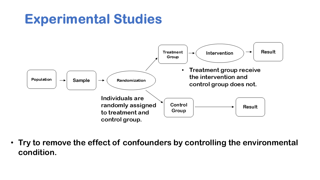
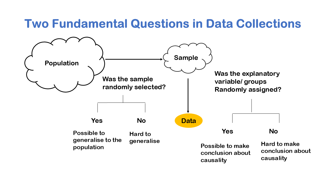
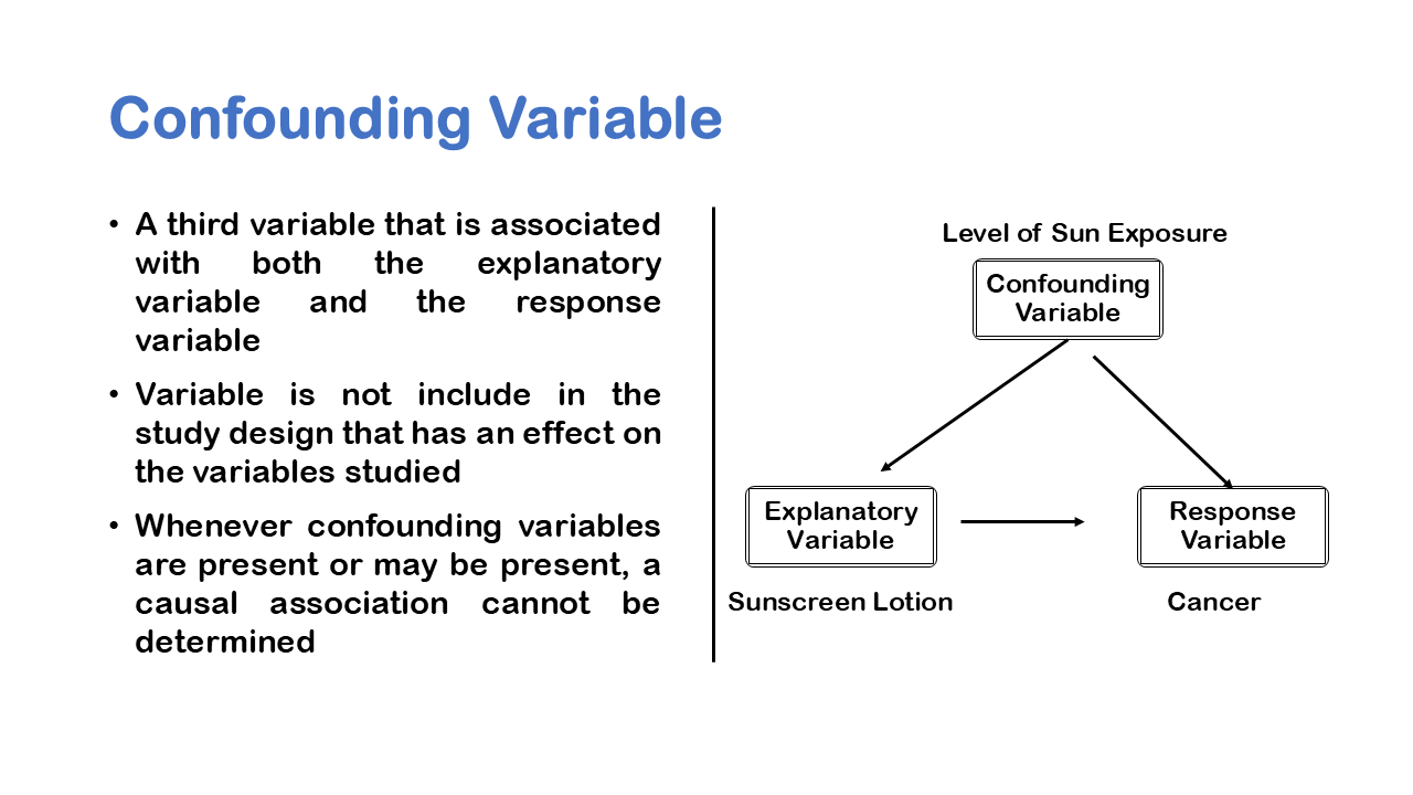
We can take an example of Obesity to understand the nuance, it’s very tempting to say that you know if you get fat, then you’re causing your friends to get fat, because of social structure. But it’s very possible that maybe a fast-food restaurant opened down the street has changed your eating habits. So, what appeared to be a cause-and-effect pattern due to social structure of friends was really caused by the fact that a fast-food restaurant opened down the street. We like to see cause and effect relationships for better conclusive results, when we have an experiment it’s much easier to prove cause and effect.

Confounding variable in general is a variable not included in the study design that has an effect on the variables studied. So, in the case of social networks and obesity a confounding variable could be the fast-food restaurant that opened down the street. To take another example, if you study sunscreen and cancer, you might say that sunscreen is causing cancer, if you just look at people who use sunscreen in cancer.

So, you might gather sample of data you might observe what’s going on over time and you might say, people who are using sunscreen are more likely to have skin cancer. However, the confounding or lurking variable could be available and you may not be considering the level of sun exposure in your study. So, people who use the sun who go out on the beach more often tend to use sunscreen more often but still that sun exposure those people tend to have higher levels of cancer skin cancer than those people who stay indoors all the time. So, there’s this confounding variable of sun exposure that you’re not adjusting for in your observational study.

Experimental Studies

The second type of statistical study is experimental studies. We use experimental studies to say something about cause and effect. Experimental studies intel the application of some intervention or treatment. The researcher is trying to change something about the world around. The idea behind an experimental study is that subjects are randomly assigned to treatment and control groups, the treatment group receives the intervention; in the control group we do not try to remove effective confounders by controlling the environmental conditions.

so, here’s another example involving neighborhoods and obesity. So, women and children living in poor neighborhoods were randomly assigned to have an opportunity to live in wealthier neighborhoods. So, the experimenters were trying to alter the behavior of people, so there’s intervention. The researcher provides the poor people an opportunity to live in a wealthier neighborhood and by applying this intervention, they examined obesity levels. As a result, they conclude the opportunity to move from a neighbor with a high level of poverty to one with a lower level of poverty was associated with modest but potentially important reductions in the prevalence of extreme obesity and diabetes.

So, they could make this claim about cause and effect, the cause being living in a poor neighborhood and the effect being obesity and diabetes levels. They could make this claim because they were applying some kind of intervention to the world. There are some major disadvantages with experiments first of all they can be unethical especially if you conduct them on vulnerable populations like animals or if the treatment is known to be harmful.

Fundamental questions in data collection

There are two Fundamental Questions in Data Collections that extend the generalizability of a result, first was the sample randomly selected from the population? And second was the explanatory variable/ groups randomly assigned in sample? The answer to both the questions will lead to generalizability and no will make the study hard to generalize. Generalization simply refers that the sample study can be applicable to the mass audience. Remember the statistical inference where we draw sample to say something about the population. Generalization means the sample study is applicable to the population.

There is an important distinction between a sample of data and population of data. So, let’s take a research question example. Does taking aspirin relieve the pain among old age population in India? Another research question you might ask about meditation, does meditating 15 minutes each day improve happiness among college student in Beijing? In the previous question asked we have a population which is Population in India having headache. And there is also a target population which is all old age people, above 60 years of age taking aspirin in India.

Explanatory variable and response variable
Also, here we will have two kinds of variables in research study, if we are using one variable to help us understand or predict values of another variable, we call the former the explanatory variable and the later the response variable. If we want to measure how much motivation effect in getting good grades, then Academic motivation at the beginning of the school year is the explanatory variable, and GPA at the end of the school year is the response variable. In the same way if, the students want to use height to predict age; so, the explanatory variable is height and the response variable is age.

Population

So, let’s talk about what a population is? A population is simply the entire collection of cases or observational units about which information is desired. So, each of these questions has a target population. In general, for population, you are talking about percentage of Buddhist in Japan, the population implied is the population of all people in Japan.

Target Population

A target population is a collection of units a researcher is interested in; a group about which the researcher wishes to draw conclusions. So, let’s look at some research questions that we pose and let’s think about what is the population might be? So, when we ask what is the average number of words spoken daily among 10-year school children in Delhi? If you are linguist and you are asking that question your implicit target population is all 10-year-old children who attend school Delhi.

For another research question if you are sociologist and you want to know about legalising use of certain drug and what people in India think about approving or disapproving such a policy. The target population is all citizens of India. That is all people who live in India.

In the same way the third research question, of the meditation the target population implied is all college students in Beijing. These research question imply target population.

Launching Sports shoes for runners
We take a final example to differentiate between population and target population. Suppose a company is launching a new line of sports shoes designed specifically for runners. Here the population would be all individuals who wear shoes, regardless of whether they are runners or not. And the target population (Subset of population) for this product would be runners, particularly those who engage in activities such as jogging, sprinting, or marathons. Also, it is useful to remember that the population encompasses a broader range of people compared to the target population.

Census

If a researcher wants to collect data on the entire population that is called conducting a census. Census have a long history, they have existed from centuries, they are existed for the purpose of empire building. A state or empire have collected information about all other citizens for collecting money for taxing them or try to encourage a population for reproduction because a growing population had led to a stronger empire. So, when you conduct census, you collect data on all people or cases in this case. The data collected could include name, gender, age birthplace and weapons that they kept in household.

There are few problems with a census as it is often difficult and expensive as you have to collect data on everybody. Especially hard to reach groups such as undocumented worker, homeless people. There are some ethical concerns with the census because when we collect data on people you are forcing everybody to participate, so there may be some ethical dilemma of violating one’s privacy. Suppose someone actually don’t want to participate but when conducted census you have to collect information on every individual. This is why many countries conduct census once in every 10 years. Because census is expensive, collecting data on everybody will cost a lot and its difficult.

Alternative to census: Sample

One solution an alternative to collecting a census is to collect a sample of the population. So here we have a population and a sample, and what we are doing is collecting a subset of that population. We take samples all the time, this is not what only statistician do, suppose you have a giant buffet with hundreds of different entrees, most people will try some subset of entrees before making a conclusion what to eat? So, you can might take chicken, or green beans just some sample of buffet and based on sample, you decide you really liked the green beans and not chickens, I am just going to have that for my meal.

When you listen to music you might scan few stations of the radio and really focus on one music, or when making decisions you might ask few people and make decisions or when buying things. The underline essence is sampling is pretty natural where you take sample of cases and you use that sample of cases to say something about a larger set of cases.

Sampling Steps

Let’s sum up the complete steps that we use to sample from a population. Let’s go back to our previous example of a Company which is launching a new line of sports shoe for runners. The population for the research is all individuals who wear shoes while the target population would be runners or joggers. In practicality we need to find our target population but the way we approach is we see who we have access to. We could get access to people who are runners through club membership, directory, or Facebook groups that is called a sampling frame. We draw a sample from using the access to people that we have. And finally, we have respondents who are those who actually responded the questions asked for the research. In the left hand we have the complete sampling steps starting from population to respondents.

The Bigger Picture

A lot of Statistics is really about going from a sample to a population the idea is to make a sample generalizable to the population. Please keep in mind that the answer or conclusion to the research problem does not make sense if it is applicable for sample, which could be generally 300 or 500. The result finding should be applicable to a wider audience that is population.

Samples are taken so frequently we like to distinguish between descriptive and inferential statistics descriptive statistics is about organizing and presenting data from a sample or population. So, you have a sample of data or you have a population of data when you’ve collected a census. In descriptive statistics you just describe the data at hand. Inferential statistics it’s about making conclusions about a population based only on data from a sample. So, in descriptive statistics you might say I’m just describing a sample of data; inferential statistics is saying something about a population based on a sample of data.

Descriptive Statistics

Let’s talk a little bit about descriptive statistics. A lot of descriptive statistics it’s about presenting data so you might present data in the form of tables or some visual tools such as bar graphs and so on. Another aspect of descriptive statistics is about summarizing data so you might look at the average height of respondents in a sample and have a numerical summary of a sample of data. You might also look at the percentage of men in a country based on some Census data in descriptive statistics. The key point is that you’re using numerical summaries to say something about the data at hand either a sample or population

Inferential Statistics

Inferential statistics involves estimating. So, for example you might use the average height from a sample to estimate the average height in a population. Inferential statistic often also involves hypothesis testing, so you might use a sample of data to test some claim. For example, you might consider the average height in a population is 72 inches, so you collect a sample and you test that hypothesis and you test that claim using that sample of data. We define Statistical inference as the process of using data from a sample to gain information about the population.

Sample Statistics and Population Parameters: Notation for sample and Population

when we talk about samples and populations, we like to distinguish between sample statistics and population parameters. A sample statistic or statistic for short is a numerical summary based on a sample for example you might say what’s the average weight in a sampled hospital patients in London that is a statistic. A parameter is a numerical summary of a population sometimes we call these population parameters, so for example the average weight of all hospital patients in London that is a parameter or population parameter.

It’s also useful to distinguish between sample size and population size, the idea is that you want to keep track of whether you have a sample of data or population. If your data set is a sample of a population the number of cases the total number of rows in your data will be labelled with a lowercase n, if your data set consists of the entire population in the number of cases is labelled capital N and this is just so we can remind ourselves whether we’re dealing with a population or a sample.

The sample statistics are numerical summaries from a sample of data are usually but not always expressed in Latin letters. For example, if you look at the average from a sample this is labelled X bar it’s pronounced X bar and this is by convention. Population parameters are generally expressed in Greek letters, so for example the average from a population is referred to by the Greek letter mu. So, you can see that we like to in general to distinguish between population parameters expressed in Greek letters and sample statistics expressed in Latin letters.