So, let’s look at another example to understand tabulating the two categorical variables. In previous article we have described presenting one categorical variable. The question that we might pose is, is men more likely to be in a relationship or its easy for female to find a life partner. One way to answer these kinds of answers is through contingency table.
So, to understand this we have two categorical variables. The two categorical variables in this example are relationship status and gender. For plotting two categorical variables, contingency table (or cross tabulation) is drawn which is just a table of counts, proportions, or percentages from two categorical variables. Both the categorical variables are plotted across columns and rows.
It’s called a contingency table because it can tell us how cases are distributed along each variable contingent (or conditional) on one or more categories of the other variable. To analyze what’s going on a contingency table it’s just a cross tabulation; it’s simply a table of counts or proportions or percentages from two categorical variables.
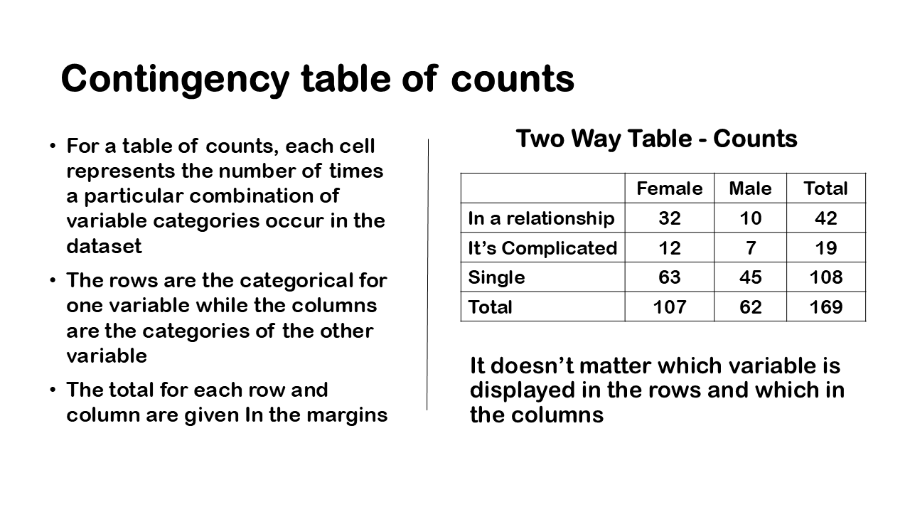
The relationship status can be categorised in three categories- in a relationship, complicated and single. These categories are across the rows of the dataset, while gender which have male and female are in the columns of the dataset. It doesn’t matter which variable is displayed in the rows and which in the columns. As in case of one categorical variable, each cell in contingency table represents the number of times a particular combination of variable categories occurs in the dataset.
Contingency table of counts

So, here’s a table of counts a contingency table of counts that displays total number of males 62 and females 107. Each cell in this contingency table will represent the number of times a particular combination of variable categories occurs in the data set and the rows of a contingency table of counts the other categories for one variable and the columns are the categories of the other variable. One thing to keep in mind is that the totals for each row and column are given in the margins
The row variable is labelled and its relationship status and then the column variable is whether or not the person is male or female. we also have the categories or levels of the variable class in the middle. You can see in the figure that we have cell counts for each combination of the categories. The row and column total gives the total no of cases in the dataset. Also, each combination of two categorical variable in the middle gives the total no of cases in the dataset. For example, if you just look at the row for the level in a relationship and the column female you can see that we have 32 females in our data set who were in a relationship.
Contingency table of Proportion

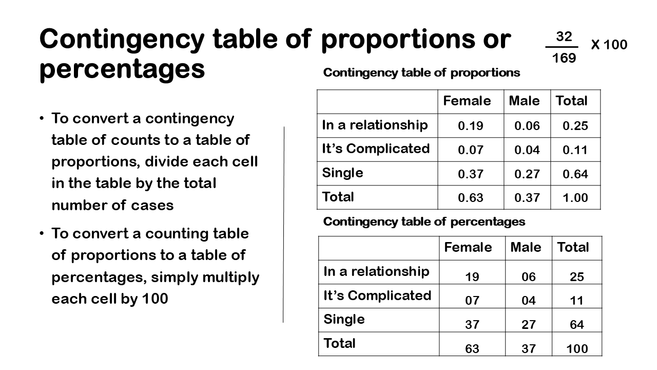
You might also encounter a contingency table of proportions or percentages. It’s useful to express a contingency table in this way because people want proportions or percentages when they’re looking at these tables. To convert a contingency table of counts to a table of proportions, divide each cell in the table by the total number of cases. To convert a counting table of proportions to a table of percentages, simply multiply each cell by 100.
So, here’s an example of converting from Counts to proportions all we’re doing is we’re taking the count for the cell, we have 32 observations and we divide by the total number of observations i.e. 169 and we get this proportion of 0.19. To convert from proportions to percentages again we just multiply the proportions by 100. So, we can say that 19% of people are in a relationship and female. To summarise the table, we can say that most of the people in the survey were single 64 percent. Also, the percentage of female in the survey is more than male, 63 % vs 37%.
Another sort of conclusion we can make is about the sort of joint combinations of the levels of the two categorical variables. We can say for example that 37 percent of females are single versus 27 percent of male who are single. To give another example, 7% of female are in complicated relationship vs 4% as male.
This kind of tabulation can really guide us or sort of provide an impetus to answering certain questions. So, in these kinds of questions, we can use tables and graphs in particular is contingency tables.
To answer questions that we posed earlier at the beginning of the table were men more likely to be in a relationship or its easy for female to find a life partner. We can see here for men its 6% vs female have 19% chances of getting a life partner. So, answer second question, were people in a complicated relationship are more than those who are single? we can see that people who are in complicated relation are 11 % vs those who are single.


