We can get the numerical summary through measures of central tendency, location, and variability for numerical data. But numbers alone don’t always tell the full story. To truly understand data, especially when considering measures of spread, it’s crucial to visualize it. Seeing the data can reveal patterns and insights that raw numbers might obscure. By creating visual representations, we can get a clearer picture of the distribution and observe how spread out our observations really are. Let’s explore how visual tools can bring our data to life and enhance our analysis!
Key Take away
- Each dot represents a different observation, indicating a different data point.
- Dot Plot is quite useful for understanding the central part of the distribution, the spread, and spotting outliers.
- Dot Plot become very messy and difficult to interpret with larger data because of the sheer number of data points.
Example
Imagine you’re an environmental scientist keen on understanding air quality across various cities. Why do some cities enjoy fresher air while others struggle with pollution? How widespread is the variation in Air Quality Index (AQI) across these cities? What’s the typical AQI if we consider all these cities together?
To tackle these questions, your first step would be to visualize the central tendency of AQI—essentially, where most AQI values cluster—and its distribution across different cities. This will give a snapshot of typical air quality. Following this, we would delve deeper into examining the spread of AQI values, exploring how far apart the best and worst air qualities are.
Visualizing these measures of central tendency and spread is crucial. It transforms raw data into a more intuitive format, making it easier to grasp the overall picture of air quality and identify any patterns or outliers that might need further investigation.
Let’s consider the example for our analysis. Here’s the following columns represents the following:
- City: The name of each city.
- Population Density (people per square km): This variable shows how crowded a city is. Some cities have a high population density, while others are more spread out.
- Air Quality Index (AQI): This variable indicates the quality of air in each city, with lower values representing better air quality.
- Average Income per Capita: This is a measure of the average income for individuals in each city. In environmental studies, income per capita can be a key factor in understanding variations in air quality and other environmental outcomes.
By analyzing these variables, we can uncover important insights about the factors influencing air quality in different cities.
Dot Plot

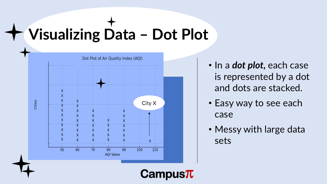
Let’s visualize this data to see how these factors interact and impact air quality across various urban areas! Here’s a Dot Plot of the Air Quality Index (AQI) in our dataset. In a Dot Plot, we typically use one dot for each observation. In this case, we have a set of cities, and each dot represents a different city, indicating a different data point or observation.
On the y-axis (the vertical axis), we have the frequency, which is the number of observations or data points for each AQI value. We can see that many cities have similar AQI values, resulting in some clustering. However, there is also variation in AQI across different cities.
We can see that most cities cluster around AQI values in the 50s,60s and 70s, indicating moderate air quality. This clustering shows the typical air quality in our set of observations. However, we do have an outlier. This outlier is City X to the extreme right, which has a significantly higher AQI, indicating much poorer air quality than the other cities.
In fact, City X is the only city in our dataset with an AQI above 100. This Dot Plot is quite useful for understanding the central part of the distribution, the spread, and whether there are any outliers. In this case, City X stands out as an outlier with much worse air quality compared to most other cities in our dataset.
Drawback
One issue with a Dot Plot is that it can become messy with large datasets. Since we are plotting each observation, if we have a large number of data points, say a dataset of a million cities, a Dot Plot will be very messy and difficult to interpret because of the sheer number of data points.


