Describing Numerical Data
In the previous articles we described two kinds of variable numerical and categorical, also known as quantitative or qualitative variable. The article can be found here. In another article we also saw how do we describe categorical variable though table of count, contingency table which can be found here. We discussed how we can visualize two categorical variables, through staked and dodged chart and through mosaic plot which can be found here. Now, it’s time to tackle numerical data! This article focuses on how do we describe numerical data? To really get a grasp on numerical data, we use measures of center and location, along with some graphical techniques.
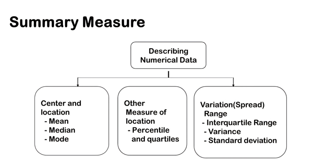
Imagine you’ve got a bunch of numbers from a survey or an experiment. How do you make sense of all this data? That’s where descriptive statistics come in. To describe the numerical data, we measure the center and location: the mean, median, and mode. Then, we also use percentiles and quartiles, which give us another way to understand the location of our data points. Next, the measures of variation or spread, determine if our data is scattered or tightly clustered. Finally, we’ll bring our data to life with visualizations, learning how to create and interpret histograms, box plots, and density plots.

Measures of Center: The center of our numerical data helps us identify the typical values. We do this by looking at:
• Mean: The average value, giving us an overall trend.
• Median: The middle value when data is ordered, showing us the central point.
• Mode: The most frequently occurring value, highlighting common trends.
Measures of Location: We also use other measures of location to dig deeper:
• Quartiles: These divide the data into quarters, providing insight into data distribution.
• Percentiles: These show the relative standing of a value within the dataset.
Measures of Dispersion: Understanding how spread out the data is helps us grasp its variability:
• Range: The difference between the maximum and minimum values.
• Interquartile Range (IQR): The range of the middle 50% of the data, offering a focused view of data spread.
• Variance and Standard Deviation: These are crucial for understanding how much the values deviate from the mean.
Visualizing Numerical Data: For numerical data, we use different visualization techniques:
• Histograms: To show the frequency distribution of data.
• Box Plots: To display the data distribution, highlighting the median, quartiles, and potential outliers.


