In the previous article we discussed how to visualize two categorical variables through dodged, staked bar graphs. Another way of visualizing a two-by-two table is through a mosaic plot. A mosaic plot can help you to visualize the unconditional and conditional aspects of a contingency table. So, there are two steps to construct a mosaic plot.

First, you just create a square and that square is divided into two vertical bars. There would be as many vertical bars as the number of categorical variables. You should have the same number of vertical bars as you have levels of a categorical variable. The width of these vertical bars is proportional to the unconditional distribution of a categorical variable. So, if you have two levels of a categorical variable then you have two bars.
The next step is we split each vertical bar horizontally proportional to the conditional distributions of some other variable. It’s really important to note that, when you create a mosaic plot, keep track of what you’re conditioning on, as it will change the whole graph.

For better understanding let’s go through an example, so first we’re going to take a square and we’re going to divide it into vertical bars, whose widths are proportional to the unconditional distribution of the first categorical variable.

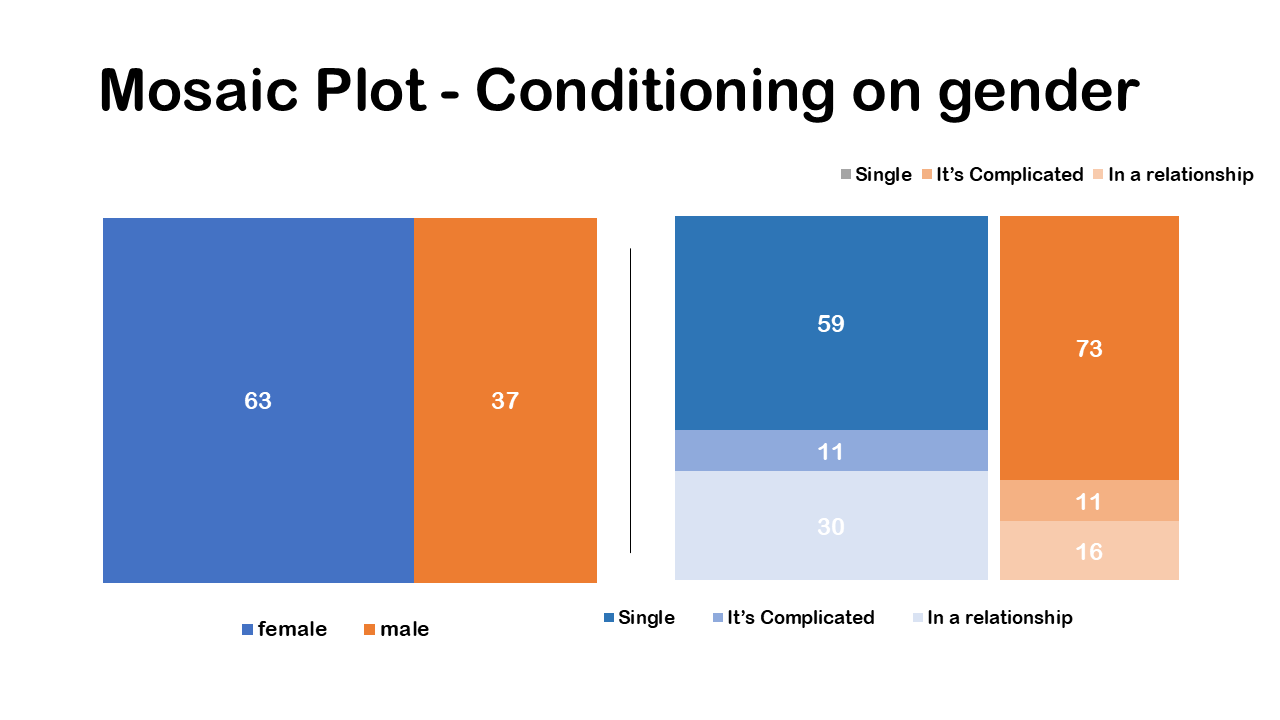
So, our first categorical variable is gender. If we look at the percentage, we can see that 63 percent of people are female and 37 are male.
We divide the square vertically in two columns as there are two categorical variables, male and female. Then we create square proportional to the width of the vertical bar for those in the female category, it’s going to be a little bit larger. because we have 63% of female as the unconditional distribution. We can see that this blue bar it’s a little bit larger in term terms of its width because 63 percent of people are females and then the orange bar for male is a little bit narrower.
This completes our first step; we we’ve created a square and divided the vertical bars equal to the number of levels for our first categorical variable. Also, the width of each bar is proportional to the unconditional distribution of the first categorical variable.
Conditioning on gender

In the second and final step, we split each bar horizontally, proportional to the conditional distributions of the row categorical variable. so, our row categorical variable is going to be relationship status at three levels. We’re going to look at the distributions of relationship status, conditional on whether you are female or male. This is just reflecting the different conditional distributions of class.
You can see here that the two vertical bars are reflecting the unconditional distribution of whether you are female or male, and the horizontal splits we have a different distribution of whether you are in a relationship, in a complicated relationship or single, conditioned on whether you are female or male. A greater percentage of people are who are single are female (59%). We can see this visually in the Mosaic plot it’s reflecting the distribution of relationship status conditional and gender. The great thing about a mosaic plot is it conveys a lot of information in a relatively concise way.
So, to conclude again on a mosaic plot, the width of the bars or the column variable gives the unconditional percentage or unconditional distribution, that visually reflect in the mosaic plot and we can see that overall, more people are female than male. Vertical splits is the conditional distributions, you can say that among those who are female a greater percentage are single.
Conditioning on relationship status


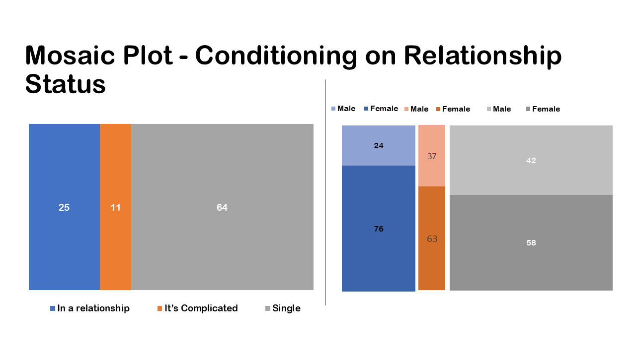
In the previous case we were conditioning on gender, now we are on relationship status. We can also make a mosaic plot by flipping the column and row variables. So, in that case the relationship status will be the unconditional distribution and then the gender in the row variable as conditional distribution. So as previously we will divide the square in three columns as in a relationship, it’s complicated, single as they represent the unconditional distribution. As a next step we split the columns horizontally as the conditional distribution of gender.
So, in this case also we can make conclusions as well, we’re just conditioning on a slightly different variable i.e. relationship status. We can conclude that overall, a greater percentage of female are single. Also, we can conclude that female have a higher percentage of being in a relationship than male.
The row variable is giving us a set of conditional distributions, so it’s really important when you create a mosaic plot to keep track of what you’re conditioning on, are you conditioning on relationship status or you’re conditioning on gender. The distribution of gender conditional in relationship status is in fact not the same as the distribution of relationship status conditional on gender. Or as posed earlier we can ask among those who are female, what percentage of people were single than complicated relationship which will reflect conditioning on gender. And the next will be among those who were in relationship, what percentage is male? so always ask yourself what am I conditioning on what are these percentages or proportions of that I’m calculating.


