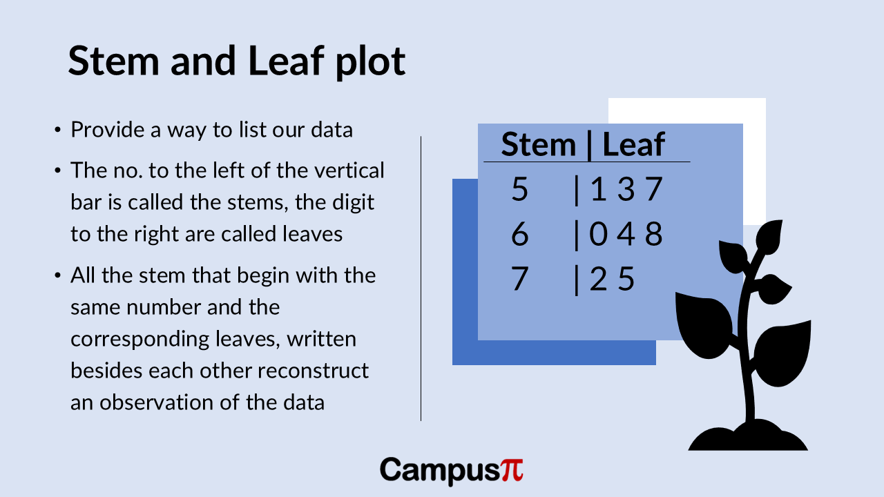
Stem and leaf plot is used to plot for a numerical variable. It’s essentially a way to list our data in an organized manner. In a stem-and-leaf plot, we have “stems” and “leaves.” The numbers to the left of a vertical bar are called stems, while the digits to the right are called leaves.
All stems that start with the same digit have their corresponding leaves written beside them. This setup allows us to reconstruct each observation in the dataset by combining the stem and the leaf.
Key Takeaway
- Stem and leaf plot is used to plot for a numerical variable.
- The numbers to the left of a vertical bar are called stems, while the digits to the right are called leaves. All stems that start with the same digit have their corresponding leaves written beside them.
- We get an instant snapshot of the minimum and maximum values.
- This plot helps us understand the distribution of values, identify the range, and see the frequency of specific values at a glance.
Let’s create a stem-and-leaf plot for the Air Quality Index (AQI) of our cities. Each observation has its own number, with a vertical bar separating the stems from the leaves.
For example, in our stem-and-leaf plot:
- The numbers to the left of the vertical bar are the stems.
- The numbers to the right of the vertical bar are the leaves.
Typically, a stem-and-leaf plot will specify what differentiates a stem from a leaf. In this case, the stem represents the leading value of our AQI number, and the leaf represents the digit in the ones place.

Here’s a simple example for clarity:
In this example:
- The stem “5” with leaves “1, 3, 7” represents AQI values of 51, 53, and 57.
- The stem “6” with leaves “0, 4, 8” represents AQI values of 60, 64, and 68.
- The stem “7” with leaves “2, 5” represents AQI values of 72 and 75.
This plot helps us see the distribution of AQI values and allows us to easily reconstruct the actual data points from the stems and leaves.
In our dataset, we have integer values for the Air Quality Index (AQI) such as 54, 56, 78, and 80, without any decimal places. Using a stem-and-leaf plot, we can quickly visualize this data.
For instance:
- The lowest AQI in our dataset is 54, represented by a stem of 5 and a leaf of 4.
- The highest AQI in our dataset is 80, represented by a stem of 8 and a leaf of 0.
Here’s what our stem-and-leaf plot might look like. We can also see it in the above figure.
Stem | Leaf
5 | 4 6
6 | 0 2 5
7 | 1 3 8
8 | 0
In this plot:
- The stem “5” with leaves “4, 6” represents AQI values of 54 and 56.
- The stem “6” with leaves “0, 2, 5” represents AQI values of 60, 62, and 65.
- The stem “7” with leaves “1, 3, 8” represents AQI values of 71, 73, and 78.
- The stem “8” with leaf “0” represents an AQI value of 80.
From this stem-and-leaf plot, we get an instant snapshot of the minimum and maximum AQI values. We can also see how many cities fall into specific AQI ranges. For example, if the plot showed that five cities had a stem of 7 and a leaf of 5, it would indicate that five cities have an AQI of 75.
This plot helps us understand the distribution of AQI values, identify the range, and see the frequency of specific values at a glance.
Problem with Stem and Leaf plot
One thing to note about a stem-and-leaf plot, similar to a Dot Plot (link to article 24), is that it works best for small datasets since all observations are represented individually. For our dataset of countries, the number of observations is manageable, making the stem-and-leaf plot quite useful.
However, for larger datasets—like those with a million people, ten thousand observations, or even 500 people, which is common in survey research in social sciences and humanities—a stem-and-leaf plot can become messy and difficult to interpret. The visual clutter from so many data points can overwhelm the plot.
In such cases, it’s more practical to use other methods or to subset your sample to a smaller set of observations. For example, in psychology, datasets are often smaller, making a stem-and-leaf plot more feasible and helpful.
So, while stem-and-leaf plots are great for small datasets, their utility diminishes as the dataset grows larger. For larger datasets, consider other visualization techniques or focus on smaller subsets to keep the plot clear and informative.


