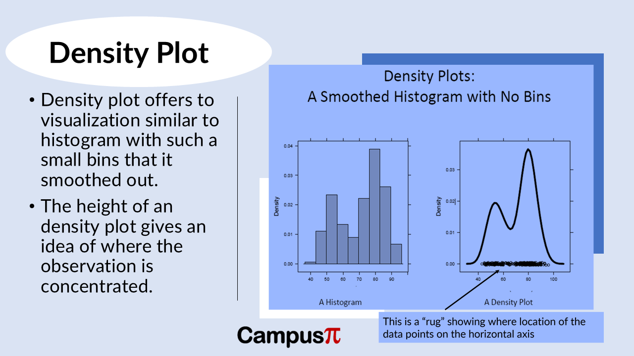
In a dataset, an alternative plot apart from the histogram is a density plot. Similar to a histogram, a density plot provides a visual representation of data distribution, but it does so by smoothing out the concept of bins.
Imagine the density plot as a histogram with incredibly small bins—so small that they blend together into a smooth curve or line that fits over the data points. Instead of discrete bars, the density plot uses this continuous curve to show where values are concentrated.

For our dataset of Air Quality Index (AQI), a density plot would display a smooth line that indicates where most cities’ AQI values cluster. It offers a clearer view of the distribution’s shape and can reveal subtle peaks or patterns that might be missed in a histogram with fewer bins.
The height of the curve in a density plot indicates the density of observations at different AQI levels, making it easier to interpret data concentration and variability across the dataset. This approach provides a nuanced understanding of how AQI values are distributed without the potential visual limitations of traditional histograms.
In a dataset, an alternative to the histogram is a density plot. It’s akin to a histogram with incredibly tiny bins, resulting in a smooth curve that represents data distribution. However, this smoothness can sometimes be misleading.
For Air Quality Index (AQI) dataset, imagine a density plot showing a continuous curve that illustrates where AQI values concentrate across cities. To enhance understanding, we often include a “rug” of data points (shown in the above figure). These points are randomly jittered along a vertical axis to prevent them from overlapping, giving a clear indication of where observations lie.
The rug in an AQI density plot would reveal a cluster of data points around the central peak, indicating where most cities’ AQI values fall. However, it might also show sparse points in the tail ends of the plot. For instance, the sparsest part might represent just one observation—say, a city with exceptionally high AQI, standing alone.
The purpose of the rug is to caution interpreters not to draw conclusions hastily from sparse data points. While the central part of the density plot might be densely populated with observations, like the peak indicating moderate AQI levels across many cities, sparse areas should be approached with caution. In our example, the sparse tail might only include one outlier city with extremely high AQI values, reminding us that interpretations should account for the distribution’s varying data density.


