Histograms are incredibly useful when you have a large dataset and want to visualize the distribution of a numerical variable. Unlike stem-and-leaf plot or dot plot that can become cluttered with too many data points, histograms groups data into intervals, or bins. Each bar in a histogram represents an interval, and its height corresponds to the number of observations within that interval.

What makes histograms versatile is its ability to adapt to datasets of any size. Whether you’re working with a small sample in psychology or a massive dataset in epidemiology; histograms can effectively summarize the data while maintaining clarity. By adjusting the number of bins, you can fine-tune the level of detail in your visualization, capturing broader trends or focusing on specific nuances in the data distribution.
Key Takeaway
- Histograms can effectively summarize the huge data while maintaining clarity. It is most widely used chart also for checking normality assumption in data set.
- It is helpful in spotting outliers.
- The representation of data heavily depends on the number of intervals, or bins, chosen.
Histograms are a go-to tool in data analysis because it provides a clear, visual snapshot of how data points are spread across different ranges, making them indispensable for exploring patterns and outliers in numerical data.
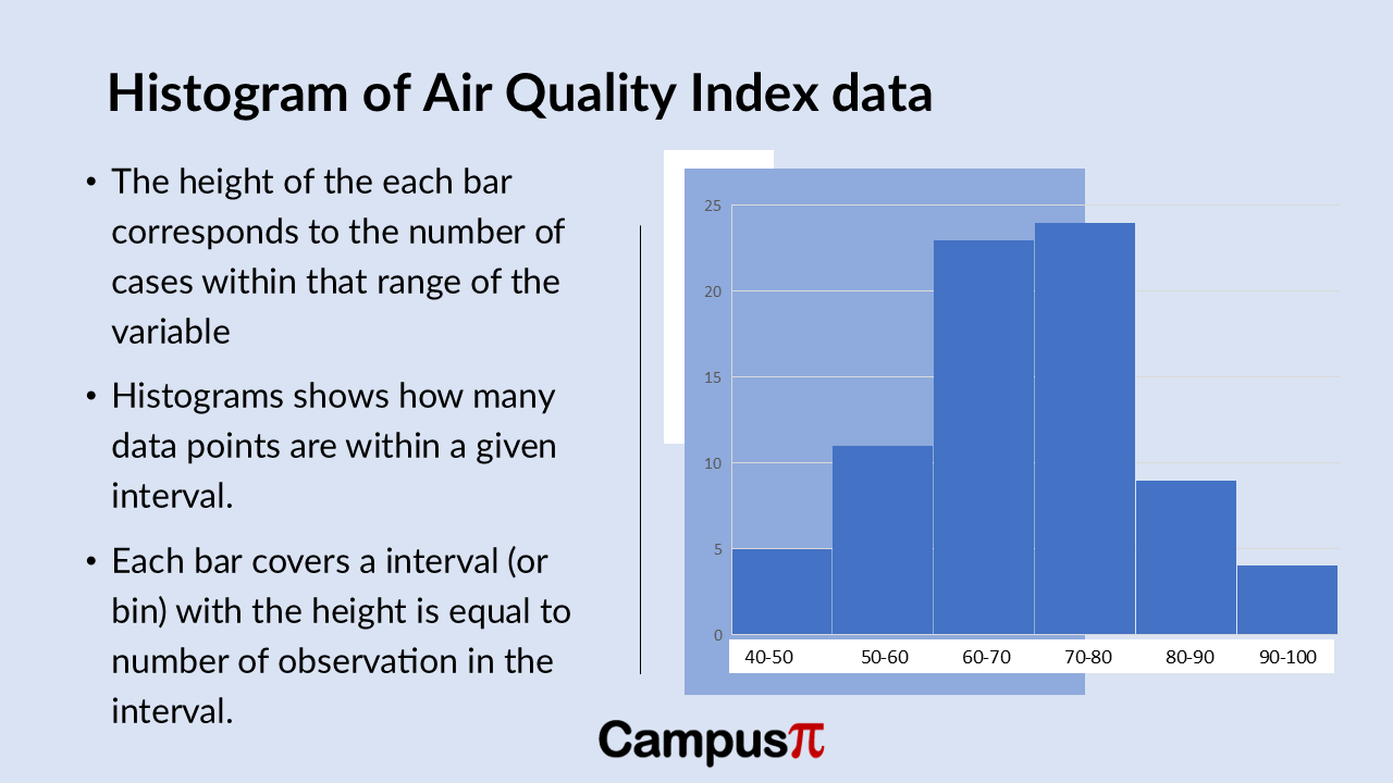
Here’s a histogram of the Air Quality Index (AQI) dataset. Similar to the Dot Plot and stem-and-leaf plot, the histogram reveals insights into the distribution of AQI values.
We can see that most cities have AQI values clustered in the moderate range, indicated by the taller bars in the 60-80 AQI range. However, there’s variability across the dataset, particularly noticeable in the lower and higher ends of the AQI spectrum.
The smallest bar on the left side of the histogram represents a few cities with exceptionally good air quality, possibly with AQI values below 50. Conversely, there might be a smaller bar on the right-side indicating cities with higher AQI values, potentially between 90 to100.
This visual representation effectively highlights any outliers or extreme values in AQI across different cities, offering a quick overview of how air quality is distributed within our dataset.

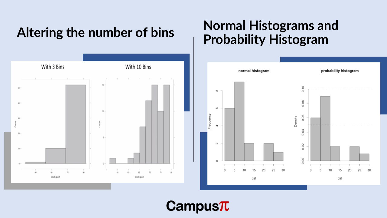
When creating a histogram of the Air Quality Index (AQI) in our dataset, the representation of data heavily depends on the number of intervals, or bins, chosen. For instance, comparing a histogram with three bins to one with ten bins can drastically alter how the data distribution appears.
With fewer bins, such as three, the histogram provides a broader overview, showing general trends and broad ranges of AQI values. In contrast, using ten bins offers a more detailed, granular view, revealing nuances in AQI distribution across narrower ranges of values.
However, histograms can be misleading if not carefully constructed. If the number of bins is too low, important details like multiple peaks or variability in AQI values might be obscured. Conversely, too many bins can create a noisy or cluttered histogram that complicates interpretation.
In summary, selecting the right number of bins in a histogram is crucial for effectively visualizing and understanding the distribution of AQI data. It strikes a balance between capturing meaningful patterns and avoiding the oversimplification or overcomplication of data insights.


