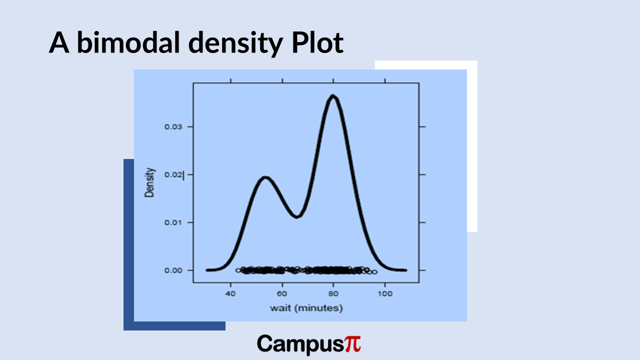
When analyzing distributions, we often discuss their modalities. The modalities is the number of peaks they exhibit. A distribution with a single prominent peak is termed unimodal. If there are two distinct peaks, it’s called bimodal, and with three peaks, it’s referred to as multimodal. These modalities describe the visual appearance of peaks in a distribution, highlighting where data points cluster most prominently.
However, identifying the number of modes in a distribution isn’t the same as determining its numerical mode, which represents the most frequently occurring value. A dataset may visually show multiple peaks (bimodal or multimodal), yet numerically, it might have only one mode.
For instance, imagine a dataset graphed as having two peaks. While numerically there might be one mode—the value with the highest frequency—visually, it’s evident that the data can be separated into two distinct distributions overlaid on each other. This visual distinction underscores the presence of two modes when considering the underlying distributions independently.
Understanding modalities in distributions is crucial for interpreting data patterns accurately. It helps analysts recognize when data may represent multiple underlying trends or phenomena, despite numerical summaries suggesting otherwise. This distinction ensures that insights drawn from data reflect its true complexity and structure, enhancing the reliability of statistical analyses and conclusions.

We can take an example of Air Quality Index. The AQI distribution will be right-skewed because of a few cities with extremely high pollution levels. These outliers skew the mean AQI upwards, making it appear higher than the median or 50th percentile. This skewing effect demonstrates why the mean can be misleading as a summary measure of typical air quality.
Despite the skew, the AQI distribution will be unimodal. This means that most cities’ AQI values cluster around a single peak, which lies in the lower to mid-range of the AQI spectrum. Most cities enjoy moderate air quality, but those few outliers with extremely high AQI values pull the overall mean upwards. This visualization highlights the importance of considering both the central tendency and the spread of data to get a true picture of air quality across different cities.
Let’s consider another example, where we did a survey of schools of get the age of every individual. When we plot the density curve, we will get a bimodal distribution. The reason we get a bimodal distribution is that the ages of the students and teachers get mixed which will create two modes of distribution. So, modality of distribution often provides a good insight in deciphering the statistical analysis.


